
Historical Advertisements in the streets of Tilburg
An analysis of three historical signs in the city of Tilburg is at the heart of this paper. The process of searching for historical signs, analyzing the texts and even visiting the ‘owners’ of one of the signs, was definitely an eye-opener. Public signs that have been on buildings and streets for years, are now being noticed. I have learned to appreciate old dilapidated texts and buildings, because of the great stories they reveal. The texts are part of the linguistic landscape in Tilburg. Their appearance is all around us in the form of social, cultural and historical signs. To understand why people made these signs, what they mean and what the link is with the area around them, you need to take a step back and have a look at all the things around and across them.
Signs with old and new stories
Communication plays a major role in everyday life. To communicate, you need a language that can be encoded by both sender and receiver (Williams, 1977). The simplest scene would be a face-to-face conversation between two people, but that is not always how reality works. A man standing on a busy road cannot tell every car when and when not to stop; we use traffic signs and lights to communicate this to the drivers. A store manager will not stand in front of his shop to tell everyone what the offer of the day is; he will simply draw a sign on a board. The city is, as Halliday (1978) once said, not only ‘a place of talk’, but a place of writing and reading too. Thus communication has multiple channels to express messages; written and unwritten. In this paper, the subject will be limited to written messages, because you cannot visit a city without noticing any textual information: traffic signs, advertisements, billboards, labels, numbers and figures.
A public sign can often be interpreted in many ways and will therefore only make sense in combination with a referent (Backhaus, 2007). For the three signs in this analysis, which are all advertising texts, this means that their referents are the store, product or company they are an advertisement for. A sign will not always be directly linked to its referent, like a label to its store. Instead, it can direct one to a referent, for example, or will simply raise attention for a referent (Backhaus, 2007). A sign can have three functions, these are the following: index, icon and symbol (Pape, 1980). Relevant for this analysis are indexes and symbols, because the language in the advertisements are symbols that each have their own indexes, which are referring to deeper layers of meaning. This is also known as ‘indexicality’.
Finding old signs beneath new signs is fascinating, because there will always be more than one historical story
Due to (super)diversity, city landscapes have become more multilingual (Backhaus, 2007). People from different linguistic backgrounds need different textual information to understand everyday life. Therefore, these spaces are full of social, cultural and historical signs, and will remind you of being and living in linguistic landscapes. Linguistic landscape' is thus a term that is used to describe the presence of different languages and signs used in a public space area (Gorter, 2006). Backhause (2007) conducted a study of linguistic signs in Tokyo, in which he searched for coexistence of older and newer versions of a given type of sign. Finding old signs beneath new signs is fascinating, because there will always be more than one historical story. Therefore, this paper will delve into deeper detail about what it means for a city or area to have signs with one or more stories. Three historical advertisements, which are located in the linguistic landscape of the city of Tilburg, in The Netherlands, will be analyzed in this paper. Both the state of the signs in their early days, and their condition today will be looked at.
Three historical signs
Nederlandsche fabriek
The first sign that will be analyzed is located in the Poststraat in Tilburg. The sign shows an old advertisement, which can be found on the first floor of a white house. The advertisement is written in Dutch in five lines below oneanother. The text is written in a brown square on the wall. The house itself has a ground floor made of white stone, whereas the first and second floors are built with regular bricks. The windows are large and high. Furthermore, the paint and the bricks of the building are damaged on several places.
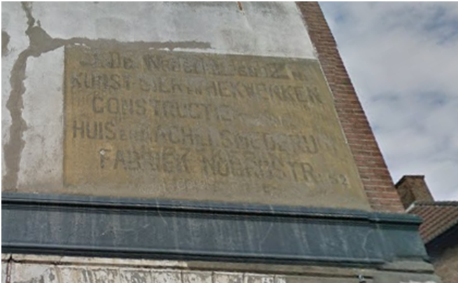
Figure 1: 'Nederlandsche fabriek', Poststraat Tilburg (3-5-2016)
Then
The house was built in 1905, and within a few years, the first advertisement was placed. After that a second advertisement was placed on top of the first one. The texts in the advertisements are written in Dutch, which is the national language of the Netherlands and therefore spoken by a large majority of people. The spelling is based on the vocabulary compiled by De Vries and Te Winkel from 1864 (Neijt, 1991). The building is described as a store-and-living-house on the list of municipal monumental buildings of Tilburg, which means that one of the advertisements was actually placed on its referent: the store or office. This store would be placed, like most stores, on the lower floor, while the first and second floor could have functioned as living spaces.
Now
The two mixed advertisements can still be seen, whereas the building itself looks quite old and ruinous. The advertisement is written in six lines in a brown square of around 1,5 by 1 metres. Not only did I choose this advertisement because of the 'old' word ‘Nederlandsche’, which in modern Dutch would be spelled 'Nederlandse', but also because of the fact that this is not just one text, but actually two advertisement texts. If you take a closer look, you will see that there are two completely different texts written over, across and below each other. Looking at the advertisement, you can notice some Dutch words. The words I immediately see are for example: ‘kunst’ (art), ‘huis’ (house) and ‘fabriek’ (factory). Based on these three words, I can conclude that the language in the advertisement is Dutch. However, it is not the Dutch we know nowadays. The word ‘Nederlandsche’ shows us that the words in the advertisement belong to an older type of Dutch spelling from the vocabulary compiled by De Vries and Te Winkel in 1864 (Neijt, 1991).
If you would separate the advertisements, the following words would appear: ‘De Nederlandsche / kunst- sier en hekwerken / constructie / huis en kachelsmederij / verzekeringen / fabriek / Noordstraat: 52 / Utrecht’’. One text is advertising for a company that sells objects for houses, like fences and stoves, while the other text is advertising for a completely different area of business, namely ‘insurances’. For one of the two advertisements it is clear that it refers to a company that is or was placed in Utrecht, because the last three words are literally an address of the company. The other advertisement could refer to a store that might have been located in the same building as the advertisement is placed on: the Poststraat in Tilburg. It is not clear though, whether the insurance company or the house-utensils company was located in the building, and which of the advertisements was placed first on the wall. The building is now documented as an official municipal monument of the city of Tilburg. This means that the building has historical value and cannot be demolished. Nowadays, the building is used for living. Although the building is very valuable, no restoration has been performed on the advertisement, or the walls, as of yet.
Handel in kaas en visch
The second sign is located in the Boomstraat in Tilburg. The sign consists of five words, written in dark letters in a white square above the door. The bricks of the house are brown and the details around the sign are white and black. Furthermore, the paint on the wall and the sign looks bright and well-maintained. The house is surrounded by more signs, such as: letters on the window, a traffic sign and the number of the house.
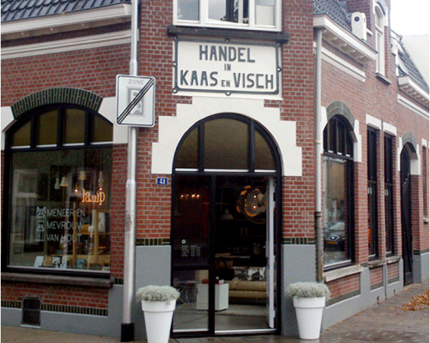
Figure 2: 'Handel in Kaas en Visch', Boomstraat Tilburg (3-5-2016)
Then
The house with the sign 'Handel in kaas en visch' on it was build in 1912 and originally owned by Henricus van Kasteren, who died in 1935 (Raak, 2006). The store was located on the ground floor of the building, whereas the first floor was used for living. The sign is placed directly onto its referent and reveals that the store was used to trade, or sell, cheese and fish: ‘Handel in Kaas en Visch’. The words ‘handel’, ‘kaas’ and ‘visch’ are written in capitals, to enhance attention to the actual purpose of the message: letting people know that this is a store and that they buy cheese and fish. Cheese and fish were seen as ‘finer food’, and for that reason these foods were not on the weekly menu of an average family. The text is written in Dutch and based on the spelling from De Vries and Te Winkel from 1864.
Now
In 2016, the advertisement is still on the same spot. The building itself is well maintained and clean. The eyecatcher of the building is the white square of stone with black text on it, which is placed above the front door. Apart from this sign, a few other signs are placed around this spot as well: the name of the former store is placed on the left window, a traffic sign is placed in front of the house, and the number ‘41’ is placed next to the front door. The advertisement itself consists of five words that are written in black. The text says: ‘Handel in Kaas en Visch’, which means that this sign is referring to a company, which was or wasn't located in the same building, that trades cheese and fish. Although the word ‘visch’ shows us an older Dutch spelling of the word ‘vis’ than is used nowadays, the piece of text is familiar to all Dutch speakers today.
Today, a designer label is located in the store, called ‘Meneer en Mevrouw van Houten’. They are designers and photographers who sell their own creations in their store. The upper floor is still being used as living space. The building is quite old, but the style still looks fresh and modern, which matches the style of the products that ‘Meneer en Mevrouw van Houten’ are selling. They did not remove the sign ‘Handel in Kaas en Visch’, but added their own sign, the name of their store, on the window. So now, the first thing that you notice is still the sign of ‘Handel in Kaas en Visch’, and not the name of the store. It does not influence the stores’ popularity though, because the building is located at a place where many people (especially cyclists) pass the street. Tilburg did a restoration of the sign a few years ago, because of its historic value. When I paid a visit to the store, one of the owners told me that they were not allowed to remove the monumental white stone. Besides, they do like it and think that the sign belongs to the building. They wanted to put the focus on the sign. Mrs. van Houten told me, that in the beginning they argued about their own brandname; whether the letters should be colored or light. They chose a small, light version, because otherwise there would be ‘too much going on’ on the building.
Broodbakkery
The third sign that will be analyzed is located in the ‘Acaciastraat’ in Tilburg. The sign is placed on a white house with yellow, red and blue details. The house is almost the exact opposite of the other houses in the street, which are all brown and look alike. The sign is the name of a store and consists of one word, which is written in red, rounded lettering. The text 'Broodbakkery' is probably made out of a type of metal and placed on a white shelf, which is about two meters high and located just above the door.
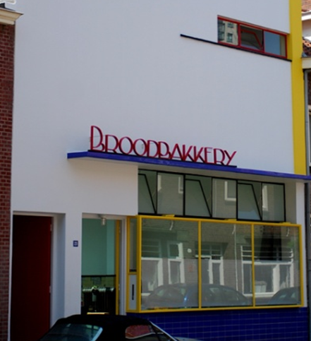
Figure 3: 'Broodbakkery', Acaciastraat Tilburg (3-5-2016)
Then
The building in the Acaciastraat in Tilburg where the sign ‘Broodbakkery’ was found, was designed by a Tilburg architect named S.G. Barenbrug in 1932. Barenbrug was known for his style of ‘functionalism’, which was related to a trend that people preferred in the 1930’s in the Netherlands: ‘De Stijl’ (the Style). The building is, with its flat white surface, straight primary colored lines and simple windows, different from the other houses in the street, which all have brown bricks and white window-frames. The first person that owned the building was A. Vorselaars: a baker. He used the ground floor for a store to sell bread, the first floor for living and the second floor functioned as an attic where flour was being produced for the bakery. Therefore, the house had multiple functions (Dijk & Van Alphen, 2001). The word ‘Broodbakkery’ refers to the bakery that was placed in the building. The text ‘Broodbakkery’ is a Dutch word and it is based on the 1864 spelling from De Vries and Te Winkel.
Now
In 2016, there is no other sign of the building having served as a baker's shop, except for the sign ‘Broodbakkery’. The letter ‘y’ at the end of the word would nowadays be written as ‘ij’. However, all Dutch speakers are still able to read and understand the meaning of the word these days. The word ‘Broodbakkery’ is written in a lettering which is typical for ‘de Stijl’. The two ‘B’s are really round and if one were to stand below the sign, onemight even take the ‘B’s for ‘D’s. On the other hand, the round letters are in contrast with the straight lined building, and therefore they are an eyecatcher. The word ‘Broodbakkery’ refers to what the building was originally built for: a bakery. I don’t even think that many bakers in the Netherlands nowadays use the term ‘BROODbakkerij’, but instead just call their store ‘Bakkerij’, because when someone says ‘bakkerij’ it is obvious that they sell bread.
The building is documented as a municipal monument of Tilburg, not only because of its historic value, but also because of the combination the building carries with regards to function and style. The white, red, blue and yellow paint on the wall show no signs of decay, and therefore, the building looks well-maintained. Today, a design company is located in the building, which is really interesting because of the different style the building has compared to the rest of the buildings in the street. In this way, they really distinguish their company. What's more, this design company, called ‘Kinkorn’ has no visual sign of their brand name or services placed on the wall of the building; only the number ‘23’, which is the number of the house in the street. The name Kin(g)Korn’ is actually the name of a brand of bread from the 1960s or ’70s: it cannot be a coincidence for a design company named after a brand of bread to be located in an old bakery. So nowadays, the building has one function: it serves as a location for a company. The sign however, has two (although indirectly linked) functions: referring to the bakery that used to be located in the building, and to the design company ‘Kinkorn’, the current resident of the building, that has a link to bread as well.
Comparison and conclusions
In all three signs, we have seen more than just text. The first sign, the advertisement in the Poststraat, is written in an older Dutch spelling. Two completely different advertisements were written on top of each other, which makes this sign even more interesting. The building on which the advertisement is placed is damaged and the sign therefore looks ‘forgotten’. Around 1905, when the advertisement(s) were new, the text surely would have done a great job referring to its goal. Nowadays, the text stands on its own, referring only to old times and not to any real products or services.
The second sign, the advertisement in the Boomstraat, is the complete opposite of the first one: the building and the text on the wall both look clean and new. The sign ‘Handel in Kaas en Visch’ referred to the store that used to be in the building. Today, there is still a store in the building, but not the one that the sign is referring to. The 2016 store owners chose to let the old sign be the eye catcher of the building, rather than their own brand name. The building and the sign still have the same look as in the early 20th century and although the text is not referring to the designstore that's in the building now, its character still remains.
The third sign is just like the second sign, located on a building that cannot be compared to others. The style of the building from the 30’s is definitely raising attention in its street. The sign on the building, ‘Broodbakkery’, refers to two things: the first function of the building, and the function that it has now. The first function was to locate a store where bread was made and sold. The function the sign has now is to refer to the design company, which is named after a brand of bread (Kingkorn), that is located in the building these days.
Tilburg needs to restore forgotten linguistic landscapes; this can make a huge difference in the way people look at the signs
All three signs have a historical, monumental, social and linguistic value in their own way. All texts in the signs were written according to the spelling by De Vries and Te Winkel, which is interesting to notice because of the tremendous differences the signs have in style, looks and condition. Although all buildings are still in use, not all signs receive the attention they deserve. Tilburg has done a few restorations on old building-advertisements, and the second sign was one of them, but they still need to restore other forgotten linguistic landscapes, such as the first sign as well. This can make a huge difference in the way people look at, interpret and react to the signs
References
Backhaus, P. (2007). Linguistic landscapes: A comparative study of urban multilingualism in Tokyo. Clevedon: Multilingual matters.
Dijk, J. & van Alphen, H. (2001). Tilburg: architectuur en stedenbouw in de gemeente Tilburg, 1850-1940: monumenten inventarisatie project. Zwolle: Waanders.
Gorter, D. (2006). Linguistic landscape: A new approach to multilingualism. Clevedon: Multilingual Matters.
Halliday, M. A. K. (1978). Language as social semiotic. London: Arnold
Neijt, A. (1991). Universele fonologie. Digitale bibliotheek voor de Nederlandse Letteren. (Last seen on 26-05-2016).
Pape, H. (1980). A Peircean theory of indexical signs and individuation. Semiotica, 31(3-4), 215-244.
Raak, C. (2006). Stadslezen, Teksten op straat in Tilburg. Stadsmuseum Tilburg.
Williams, E. (1977). Experimental comparisons of face-to-face and mediated communication: A review. Psychological Bulletin, 84(5), 963.