
Strijp-S: A Straight Line To Urban Rejuvenation
The moment the Strijp S area of Eindhoven gained a hyphen and came to be designated as Strijp-S, it signaled to the wider community that the area had entered a new era. Websites and promotional material describe Strijp-S as cultural, creative and innovative, and generally emphasize both its (industrial) heritage, namely having belonged to electronics company Philips, and current concepts that are to bring energy, change and development to the area for years to come. By taking a closer look at various signs visible in the area, I aim to analyse if the concept of innovation is reflected in the linguistic landscape beyond the hyphen added to the area formerly known as Strijp.
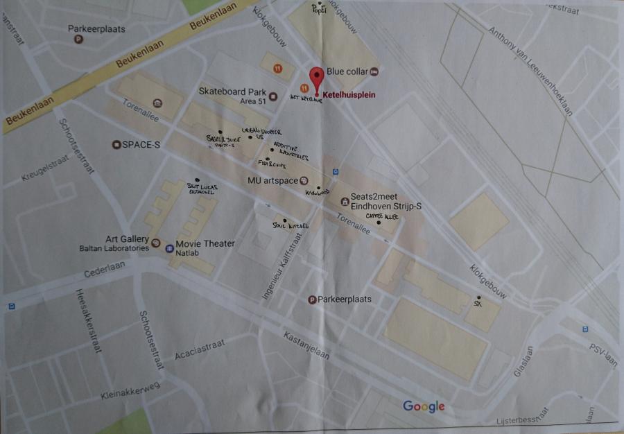
Figure 1: Strijp-S map
A linguistic landscape of innovation
Innovation can be said to form the connection between a past in which Strijp attracted Einstein and was even responsible for the invention of the synthesizer, and a present that is looking to the future by offering space and opportunities to start-ups and new ideas. As mentioned earlier, this article focuses specifically on the concept of innovation and its relation to signs in the linguistic landsape. Granted, innovation has become a somewhat overused concept, but here it is understood in its most basic meaning as something new that enhances what is already present. In order to capture this dialogue between the old and the new, various signs - namely directions, graffiti, names of commercial enterprises and sculptures - are brought into relation with each other so as to see if this dialogue is reflected in Strijp-S’ visible signs. As such, this paper responds to what Jan Blommaert has stated on using Linguistic Landscape Studies as a means to “considerably expand the range of sociolinguistic description from, typically, (groups of) speakers to spaces, the physical spaces in which such speakers dwell and in which they pick up and leave, so to speak, linguistic deposits, signposts and roadmaps.” (Blommaert, 2012, p. 5).
Strijp-S is a highly diverse area in terms of urban purposes, and might also be an example of Vertovec's superdiversity. Vertovec uses this term to discuss diversity within diversity as a result of intersecting social, cultural and economic differences (Blommaert, 2012). While Strijp-S combines residential, commercial, educational, cultural and leisure purposes, a further investigation of the linguistic landscape can reveal if this also leads to “superdiversity”, which is an additional aim of this paper.
The historical past becomes part of the present in the naming of buildings that form the historical heritage of the region
Initially, the Strijp-S area comprised two main residential buildings, namely Anton and Gerard, but soon more residential apartment buildings were added and are currently still being constructed. The educational purpose of Strijp-S is represented mainly by two institutions, namely Sint Lucas, a creative tech school for ages 12 through 20, and SingularityU, The Netherlands, which is aimed at adults as a post-university center. The latter is originally a Silicon Valley think tank that offers educational programs and courses focused on “exponential technologies.” In addition to these institutions, one can also find spaces such as “De Ontdekfabriek”, which offers educational activities. A skate and BMX park, art house theater, health club, art gallery and musical workspaces form some of the cultural and leisure elements. A significant part of the area is dedicated to commercial enterprises ranging from those with a focus on fashion, to furniture, to the foodservice industry. However, such a classification is not always straightforward, as some spaces are multifunctional and offer educational spaces, food and creative workspaces. Finally, Strijp-S is focused on technology and technological innovation.
Finding your way in Strijp-S
To find one’s way around the newly developed area, one can make use of the directions placed around the area. Figures 2 and 3 show an example of the cubes used for that purpose.
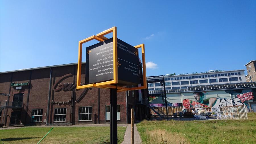
Figure 2: Directional sign
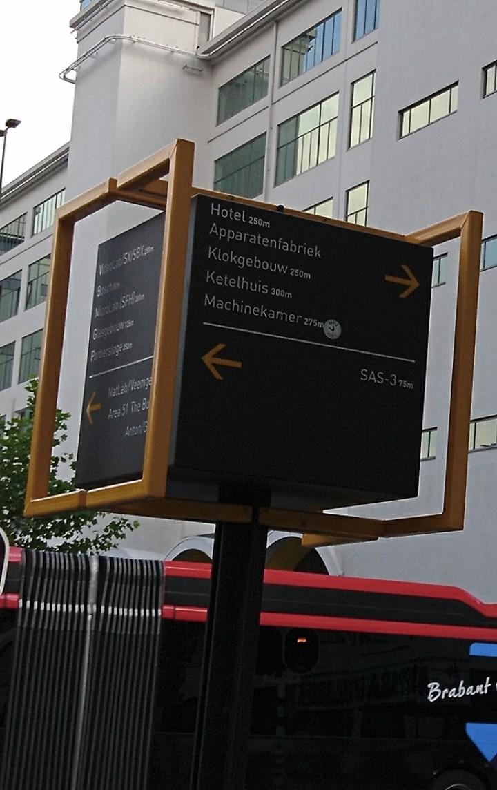
Figure 3: Directional sign at Strijp-S
The signs in Figures 2 and 3 are very distinctive as a result of their shape. Whereas directions are often printed on flat signs, these cubes are decidedly three-dimensional. The box-like shape in combination with the grey-black and yellow metal frames evokes an industrial feel that refers back to the industrial past of the area, while also using a type of directional sign that is new in urban areas. In terms of visible language used, these directions to the various buildings and main spaces show the dominance of Dutch. The spaces identified on the boxes generally direct people to the various buildings, not the smaller initiatives, shops and restaurants located in the buildings. All of these have a Dutch name and refer back to the historical past of the area. The “Apparatenfabriek”, for example, refers to the fact that it is housed in the Philips building where the first radios were manufactured (the “radio-apparatenfabriek”), and the “Machinekamer” housed the most important engines and pumps. The historical past thus becomes part of the present in the naming of buildings that form the historical heritage of the region.
Historical buildings and new names
It makes sense that the signs for direction refer to buildings rather than specific shops and enterprises, since the latter might be more subject to change , while the previous are more permanent. As a result of this condensed overview of the area - linguistically designated on a box in the Dutch language - the contrast with many of the commercial enterprises, those who have moved into the historical buildings in order to rejuvenate the area, becomes more apparent. Shops and restaurants are very often indicated in English. The Urban Shopper area (Figure 4) is one such example, and is located in the Anton building. The name of the area is printed on the windows, including its abbreviation US. This abbreviation refers to the shopping center, but it also bears the symbolic meaning of a community, when understood in its use as an English pronoun, “us”. In addition to the name, the windows also include English words that explain the services and commodities that can be found inside. Interestingly, though, not all the shop names inside the Urban Shopper have English names. A bike store located there has the French name Velo D’Anvers, for example, and a children’s bookstore has the Dutch name Boekenberg.
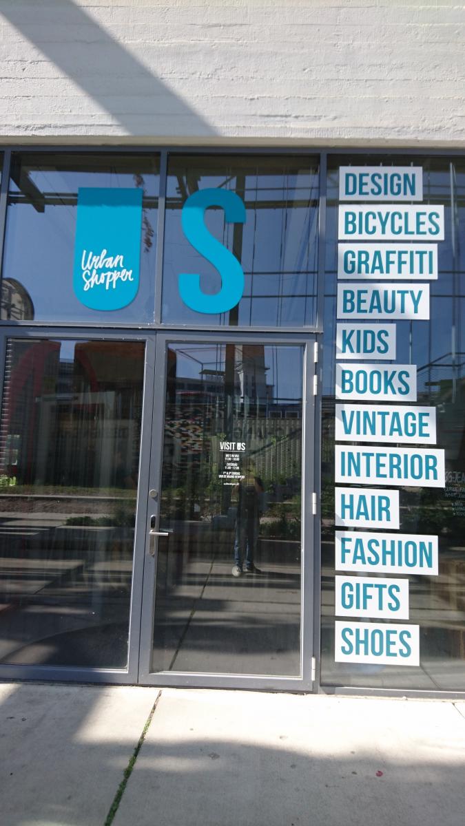
Figure 4: Urban Shopper US
The food service industry shows a mix of Dutch and English. Some are named after their location. The Ketelhuis, for example, has a separate Koffiehuisje on one end of the building, and the Leidingstraat hosts a lunch venue called Onder de Leidingstraat. Others have an English name, such as Bagels and Juice, Fish and Chips and Soul Kitchen. The variety of languages is limited to these two language until one enters the Vershal het Veem, which includes a bit more variety, such as a Moroccan deli, Le Souk, but again most signs are in Dutch and English, including the Turkish deli called Fresh Anatalia Market.
The innovative enterprises, focused on forms of collaborative work are often indicated in English, but this is an English influenced by the digital world. Seats2Meet, a location which offers spaces for events, work and meetings, includes numericals and thus evokes a context of text language and digital communication. SX, a large open-plan building which houses companies active in sports, marketing and media, includes a symbolic X which stands for cross pollination, eXperience and a multiplication thereof. Moreover, SX uses an abbreviation to refer to a word or a larger idea, which is also characteristic of digital communication. The use of English is evident and is used more frequently in businesses focused on (technological) innovation. Perhaps using English is seen as indicative of innovation, since new trends often have their origins in the English-speaking world.. What's more, the English used by these companies includes another element of innovation, as they use the English of the digital world.
The rejuvenation of the Strijp-S area has meant a stripping down of the old factories and a restoration of their facades, in order to reveal their beauty
As a historical space, Strijp-S bears the tradition of being an area dedicated to innovative technology. The industrial buildings continue that tradition and thus create particular patterns of expectation. This is reflected in many of the current companies located at Strijp-S. One example of this is the first 3D printing factory, Additive Industries, that started here in 2013. As Figure 5 shows, the store front does not impose on the original appearance of the building or space with elements that stand out, such as a large sign. Instead, the shop name is printed on the window. The focus on technology and science is communicated through iconic images that evoke the digital world and that represent a microscope, a globe and the human thinking process, represented as mechanical cogs located where the brain would be. The signs communicate a clear message through both the English and visual language, but do not demand attention.
Another company focused on technology is even less visibly present. “Enversed” is a company that offers virtual and augmented experiences and is located on the seventh floor of the Veemgebouw. The only clue to its location is a large black sign on the side of the building. “Veem” is written in the largest font, followed by the number of the floor. The name of the company has been indicated in a somewhat smaller font, and the information that clarifies what kind of company it is, is even smaller, although a contrasting blue is used to make that information stand out from the rest (see Figure 5).
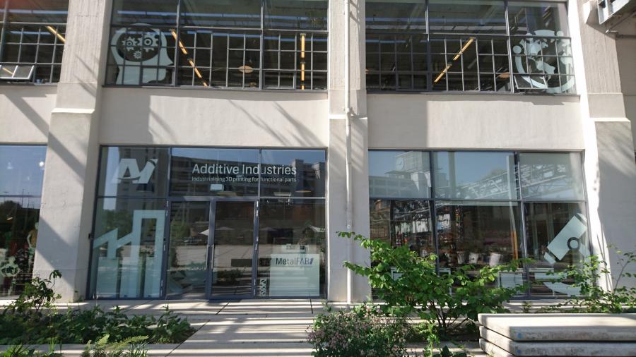
Figure 5: 3D Printing Factory
As a result, the company, like Additive Industries, does not impose on the landscape of the area. An additional similarity is the use of English instead of Dutch, although it should be noted that “enversed” might sound English, but is not a word one can find in the English dictionary.
The notion of different forms of English is also present in the window front of SingularityU, The Netherlands. SingularityU offers educational programs focused on innovative technologies and sustainability. Artificial Intelligence and the self-learning multiplication it stands for is one of the core elements the institution focuses on. Figure 6 shows the use of symbols to quickly communicate what SingularityU stands for. Similarly to the earlier mentioned storefront of Additive Industries, these symbols are like the icons we see on the internet and on computers.
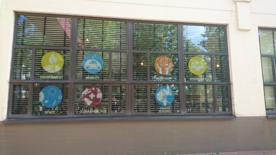
Figure 6: SingularityU, use of Symbols
With this tradition of innovative technology in mind, perhaps some of the most curious and interesting signs are the three white blocks positioned in the middle of the green area that divides the traffic of the Torenallee street, right between the building that houses Sint Lucas and the building that houses SingularityU, The Netherlands. The position of these signs, in the middle of the road, the contrasting color of the white in between the grey concrete of the roads and the green of the grass, and their size all draw the onlooker's attention. These three blocks show the sequential stages of the traditional art of sculpting: the first shows the block, intact and untouched, the next shows how the first parts have been chiseled off, and the third clearly shows that the head and body follow a classical Greek style (see Figure 7).
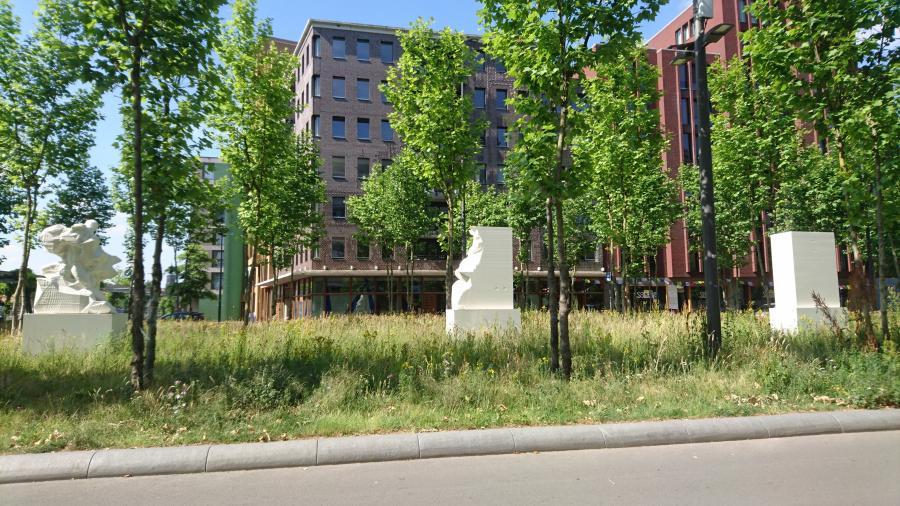
Figure 7: Three White Blocks
The process of sculpting, which is a very classical art form through which meaningful signs are created, is the direct opposite of the process of 3D printing. While the first needs to remove unnecessary elements, followed by a process of polishing to reveal the beauty hidden within, 3D printing builds from the ground up by carefully adding layers. Similarly, the rejuvenation of the Strijp-S area has meant a stripping down of old factories and a restoration of their facades, in order to reveal their beauty. This is combined with the construction of completely new buildings, all designed by architectural firms. However, such a distinctive sign, that is seemingly the opposite of what the space is meant to represent, even more so because of its placing, is likely to make visitors wonder about its meaning.
A sign of protest
A final interesting semiotic sign can be found on the fringe of the area. Eindhoven invests in graffiti art, and many larger walls are covered by graffiti art. The Berenkuil intersection is an example of this. In Strijp-S, the skatepark Area 51 is covered in commissioned, professional graffiti. Apart from this professional work, one will not find a significant amount of graffiti in Strijp-S. However, the tracks for the train network are close to Strijp-S and at the South-Eastern fringe of the area, a railway bridge can be found that crosses an intersection and therefore provides graffiti artists with a rather large blank canvas. This space is used by amateur artists but one piece of graffiti immediately stands out, mainly as a result of its size. Figures 8, 9 and 10 give an idea of its size and appearance.
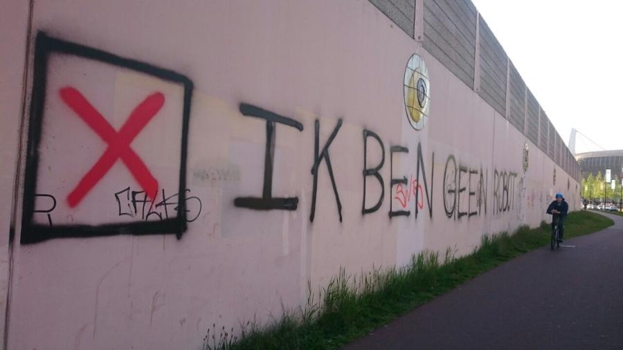
Figure 8: “IK BEN GEEN ROBOT”, Strijp S, Eindhoven, 04.05.2017
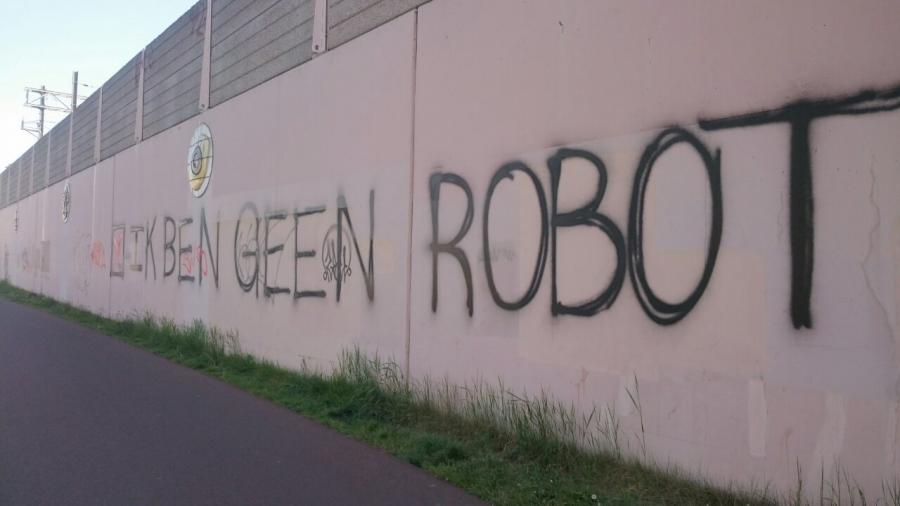
Figure 9: “IK BEN GEEN ROBOT”
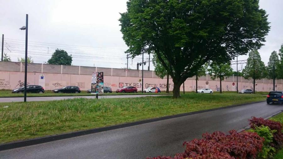
Figure 10: “IK BEN GEEN ROBOT” viewpoint Strijp-S Triangle
The graffiti reads “IK BEN GEEN ROBOT” (I’m not a robot) and is visible when one exits the SX building. It is written in all capital letters and is large enough to be read from a significant distance. In the digital world, writing in all caps is seen as yelling, and this makes the graffiti even more noticeable. This piece of graffiti comes across as protesting technological innovations and therefore, by association, Strijp-S itself.
“I’m not a robot” is a technological invention created by the American company Google and is also known as reCAPTCHA (Greenberg, 2014.) It is an improvement of the CAPTCHA checkpoints used on the internet that are supposed to weed out actual users from spambots. However, CAPTCHA caused difficulties for users, as the images of letters and words that needed to be retyped were badly legible a lot of the time. Google then invented a process that allows people to simply agree with the statement “I am not a robot”, after which a green checkmark briefly appears, and people can move on to the next page without having to go through the difficulty of CAPTCHA. For this to happen though, reCAPTCHA does look into browser history, IP addresses and cookies. In other words, the technology relies on tracking big data.
The graffiti is written in Dutch, even though, as I just pointed out, the original phrase is the English I’m not a robot. The Dutch sentence is not a literal translation of the English, but has been adjusted in accordance with Dutch grammar. So instead of writing “ik ben niet een robot”, the phrase correctly reads “ik ben geen robot.” This translation can be seen as both a refusal to use English and as an attempt to sustain the importance of Dutch. Another effect of this is that the range of addressed readers is now larger than that of the original phrase. Those familiar with the English phrase are likely to understand the message and what it refers to, namely the context of having to click a button in order to prove that one is not a robot. Those who know a bit more about the processes behind reCAPTCHA also know that agreeing with this question means agreeing with data collection. Finally, Dutch speakers who do not speak English and/or are not familiar with the “I’m not a robot” phrase can also understand, but its meaning will be different to them than to those who are indeed familiar with reCAPTCHA. The message can be seen as a complaint against work demands that demand an almost inhumane number of work hours; it can also be seen as a complaint against repetitive and mind-numbing work, and finally it can be seen as a complaint against a world in which the boundary between humans and robots is becoming unclear.
The box right before the phrase is also an interesting semiotic sign. While it obviously is a necessary part of the sentence in order to communicate its connection to reCAPTCHA and to add that layer of meaning to the message, the box is also slightly altered. Online, one sees a green tick when clicking the box; the graffiti, however, portrays a red cross. What's more, the graffiti is a good example of intertextuality in the linguistic landscape. As Blommaert (2012) explains, intertextuality is “not just about borrowing and re-using ‘texts’ in the traditional sense of the term, it’s about reshaping, reordering, reframing the text from one social world of usage into another one.” (p.34) This piece of graffiti takes an original text from the digital world, reshapes the language from English to grammatically correct Dutch and the symbol from a green tick to a red cross, so that its reframing into a social world where innovative technology is valued greatly gives the original text a new meaning.
The connotation of a green tick is usually agreement and positivity, while a red cross has the connotation of disagreement, limits and negativity. Red is a more noticeable color and so the addressee is likely to not only notice to graffiti more, but because of the combination of the red and the cross, the first association the first association people will have when seeing the graffiti is likely to be along the lines of disagreement and anti, which makes it almost a political statement. Altogether, the graffiti becomes a statement against technology and against what the geographical area represents and promotes, and possibly even against the growing influence of English on Dutch.
Superdiversity?
Historical spaces often include several languages as a result of the various ethnic groups that have moved in and out of the area. Despite the diversity in urban purposes, the signs and linguistic landscape in Strijp-S do not illustrate the superdiversity one would expect in an urban historical area. The history of Strijp-S is decidedly Dutch and industrial, because the entire area belonged to one commercial company in the past, and hence the temporal process needed to achieve a state of social, cultural and economic diversity has only just started. The names of structural points in the area, those which are unlikely to change soon, refer to the industrial and innovative past and are all Dutch. The food service and leisure industry include a mix of Dutch and English, and only very recently have other languages become visible in the area, but this is still very limited. Companies and services focused on technology and the future are decidedly more English-oriented. Interestingly, their use of English is often influenced by the English used in the digital world and includes numbers that represent words, icon-like symbols and abbreviations.
The mix of languages therefore mostly speaks to people of a generation that matured in a digital world, or feels very comfortable in it, and communicates either in Dutch and English, or in English and thus lacks true diversity. Simultaneously, this is a mix of languages and signs that contributes to a linguistic landscape that reflects innovation. The graffiti protest on the fringes of the area, in turn, could be seen as reinforcing the boundaries of Strijp-S as a contained area in the larger city.
References
Blommaert, J. (2012). Chronicles of Complexity: Ethnography, Superdiversity and Linguistic Landscapes.
Greenberg, A. (2014, March 12) Google Can Now Tell You’re Not a Robot with Just One Click.
Introduction. Introduction | STRIJP S.
Ontdek SX. Ontdek SX.
Strijp-S: Turning the Relocation of a Leading Company into an Urban Rejuvenation Success Story [PDF file] (2015, October 14).