
Homemade semiotics and linguistic landscaping
A linguistic analysis of homemade signs in Tilburg
In this paper we aim to analyze linguistic landscapes found in and around the city of Tilburg. The focus will be on bottom-up homemade signs and on how authenticity plays a role in the sociolinguistic characteristics of these signs.
Bottom-up homemade signs are very common throughout the city of Tilburg. Bottom-up signs are not made by an official body or institution, but by individuals or informal producers. For that reason, they are unique and mostly homemade. These signs can, among other places, be found at people’s homes, at small shops and in the streets. The reason why they can be found in these particular places is that their producers may not have the money for bigger, nicer and more professional signs or simply don't need these. In this paper we will have a detailed look at the characteristics of some bottom-up signs that we collected during fieldwork in the city of Tilburg. The signs include notice boards, announcement notes, stickers and a window painting. They were all found in the public sphere and they were all homemade. In our analysis we will focus on the homemade charateristic of each sign and on their emplacements. We will furthermore go into aspects of identity and authenticiy. In doing so, we will as far as possible also pay attention to the origins of the signs as well as to their intentions, consequences and possible audiences.
Je Weet Zelluf kapsalon
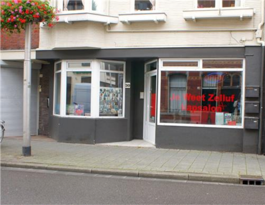
This is an image of a hair salon on Korvelseweg in Tilburg. The sign on the window of the shop says ‘Je Weet Zelluf Kapsalon’ in large bold red letters, which refers to the name of the shop. The letters match the interior of the hair salon. The text could be translated into ‘You Know Yourself Hair Salon’.
‘Je weet zelluf’ (Standard Dutch 'Je weet zelf') is a slang-like expression similar to the English equivalent ‘You know what I’m saying’. The expression ‘Je weet zelluf’ can be considered as street language, since it is mainly used in informal encounters and is most popular amongst immigrant youngsters in urban areas. The phrase might have gained popularity after the release of a rap song in 2007. Consequently, the name of the hair salon could refer to this song by Ali B ft. The Opposites, which is similarly titled ‘Je Weet Zelluf’. The song’s lyrics contain typical rap elements and describe a successful lifestyle, gaining fame and not letting negative people affect you (to put it lightly). The song contains a lot of swearing and street language, which exemplifies (Dutch) rap music in general. Some of the chorus in the song is as follows (rough English tanslation in brackets):
Strakker dan strak zie me lopen door de stad (Tighter than tight see me walking through the town)
En zeg je wat (je weet zelluf) (And you say what (you know yourself))
Homie wat (je weet zelluf) (Homie what (you know yourself))
Ali B Biggie 2 ja je kent ons van TV (Ali B Biggie 2 yeah you know us from TV)
We zeggen wat (je weet zelluf) (We say what (you know yourself))
Homie wat (je weet zelluf)’ (Homie what (you know yourself))
In these lyrics, ‘je weet zelluf’ is hinting at the fact that the audience will recognize the rappers from TV. They already know them, therefore they do not have to introduce themselves. The lyrics ('je weet zelluf') are pronounced with an Antillean accent, hence the spelling ‘zelluf’ instead of standard Dutch ‘zelf’. The owners of the hair salon might have opted for exactly this name for their shop because it suggests that they in fact do not need a name for their salon, because people would already know it themselves. Hence: ‘Je weet zelluf’.
The hair salon specializes in black hair, weaves, hair pieces and the like. It also sells supplies specifically for black/frizzy hair. This indicates that the salon’s main clientele are people of color or having an ethnic minority background. In this context, the name ‘Je Weet Zelluf’ makes even more sense, since the rappers from the song are of Moroccan descent. Ethnic minority youngsters are especially likely to listen to this genre of music and use street language (straattaal). Therefore, they are likely to understand and appreciate the reference that the name Je Weet Zelluf includes. They share a certain connection ans sense a feeling of being welcome to this hair salon. Thus, the name could be a clever tactic to create a sense of community amongst their clientele.
Je Weet Zelluf also has a Facebook page. On the Facebook page, they at times refer to their salon as JWZ, which is an abbreviated variation of ‘Je Weet Zelluf’. This abbreviation is frequently used on social media, just like ‘je weet zelluf’ it is a part of online street language and youth slang. On the page, they share information about their business, and sometimes clients react to these posts. One can indeed see that most of the clientele are people of color. It is especially notable that several clients are of Curaçaoan origin and use code switching on their Facebook page between Standard-Dutch and Curaçao-Dutch. This confirms that more than two languages are used in the salon, and that a particular Curaçaoan variety of Dutch is not uncommonly spoken there. Therefore, one could argue that the name of the salon is an embodiment of the culture of the owners and their clientele.
UiTRiT VRijLATEN
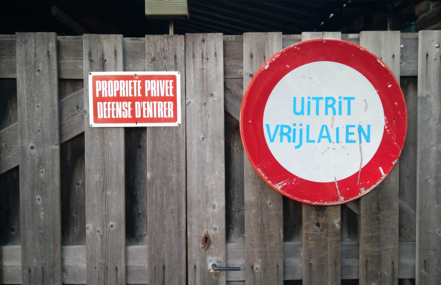
The ensemble of signs above is found in the city of Tilburg, in the neighbourhood ‘Oud Noord’. It features two languages: French and Dutch. The sign on the left is written in French: ‘PROPRIETE PRIVEE DEFENSE D’ENTRER’ ('Private property, forbidden to enter'). The sign on the right is in Dutch: ‘UiTRiT VRijLATEN’ (‘Leave exit free'). Note that everything is in capital letters except the letters 'i' and the ‘j’ in the Dutch sign. A third ‘language’ can be found in the red color in both signs and the shape of the Dutch sign, semiotically referring to 'danger - watch out - forbidden' and 'forbidden for all traffic' (according to international traffic sign semiotics) respectively. Both signs are placed on a wooden entrance fence which leads to a backyard. If we include the semiotics of color and shape, this ensemble of signs has three languages, making it multilingual (Van Herk, 2012). One could study these signs independently, but since they are found on the same fence, they could also be studied together as one sociolinguistic landscape.
The sign on the left is monolingual, only containing French. At first sight, this sign looks like it might have been bought in France during a holiday and taken back home as a decoration. The intention of this sign is to forbid individuals to enter. This sign may very well be an official sign in France, but in Tilburg however it has no legitimacy because it does not count as an official sign under Dutch law. Since this sign is written in French, it will moreover not have much impact because many of the people who see it will not even understand what it says. One could argue that those who put this sign on their fence were aware of this and bought it mainly because they appreciated the sign's aesthetics or its use of French and not so much because they wanted to convey the message that peple should not enter their property. It could of course also be that all mentioned aspects played a role.
The sign on the right is the shape and color of an international traffic sign referring to 'no vehicular traffic from both sides'. However, the text that is most probably added by the residents who put it on their fence has a different meaning, i.e. ‘leave the exit free’. This sign, too, is illegitimate, because of the fact that it is homemade. Official traffic signs are not placed on private property and they are not decorated with neon blue letters. We already refered to the fact that in this sign all the letters are in capitals except for the ‘i’ and the ‘j’. This might be because the makers of the sign thought that the capital letter of ‘i’ looks very similar to an 'l' and therefore could lead to confusion. Yet, they wanted to convey the message that others should leave their exit free. The audience-design of this sign shows how its producers tried to make two in the Dutch context non-ligitimate signs legitimate by combining them in an ensemble and how they tried to convey authority by adding a formal text in Dutch that loses quite a bit of its authority as a consequence of the grassroot characteristics in its writing.
These two signs form an ensemble. They share certain similarities that show that they are put in place by one and the same actor. They both share the same goal: to convey a clear message and project authority. Because of the homemade character of the signs, this message is not as strong and autoritative as it might have been intended. The signs, however, show individuality and as such tells us something about their producers.
ONS HÛSKE
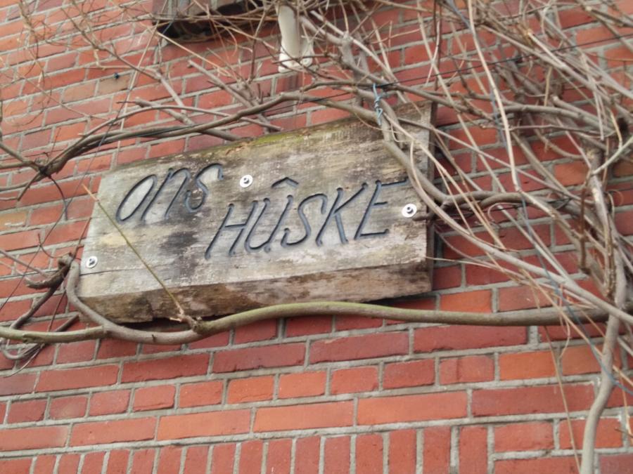
This sign is found in the northern part of Tilburg. It is a house name in Tilburg dialect: 'Ons Hûske' (our little house). This is probably more a case of speaker-design rather than audience-design. The goal of giving a name to a house is usually to make it more personal, to make the house more ‘ours’. The term ‘ons’ (our) refers solely to the family living in this house. The text is burned in or cut out of a piece of wood. This is done quite professionally and establishes a homemade look, which adds to the personal meaning of the sign.
Most dialects are mainly used in speaking. So, when people are going to write in dialect, they have to think about orthography. Here the Dutch word 'huisje' (little house), which is a diminutive. is written down as ‘hûske’. However, in the Tilburg dialect dictionary, this word is given as 'hèùske', höske and 'kotje' (the corresponding words for 'huis' (house) are ‘hèùs’, ‘höös' and 'kot/kiet’) . The form 'hûske' however is missing. When having a look at a dialect map for ‘huisje’ on the same website, we can see that ‘huuske’ or something similar is more frequently used in the northern part of the Province of Limburg, in the Betuwe (Province of Gelderland) and in the Province of Groningen. The people who live here might originally come from one of these areas and have used their native dialect to name their house. On the other hand, they may have simply assumed this was the correct way to spell this word; this is the way they pronounce Tilburg dialect themselves or this is the way they think they hear other people pronounce it.
HONDEN-LIEFHEBBERS
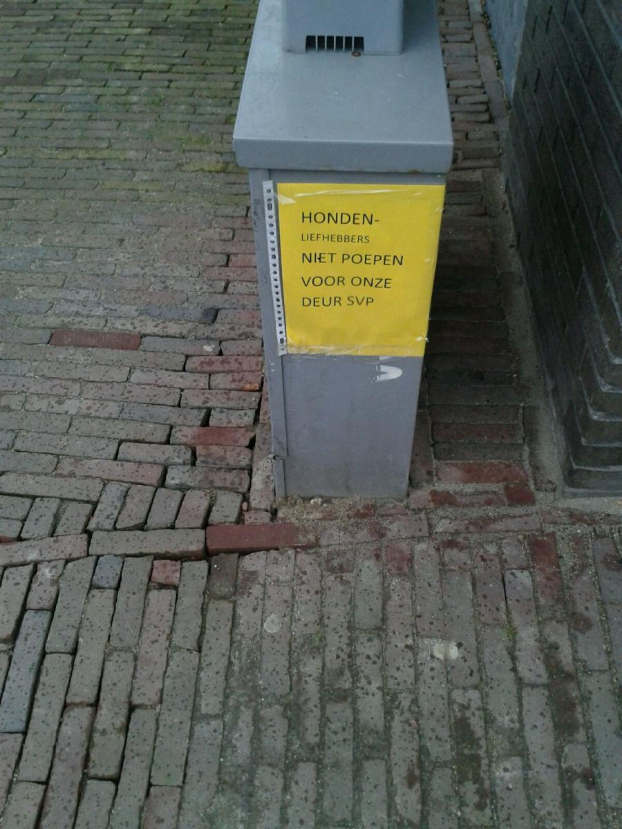
This sign is found next to a bicycle shop in Riel, a small village near Tilburg. The sign is a printed A4 sheet of bright yellow paper containing one sentence: ‘HONDEN-LIEFHEBBERS NIET POEPEN VOOR ONZE DEUR SVP’. When translated into English, it would mean something like: ‘Dog-lovers do not poop in front of our door please’. All the letters are capitalized and have the same font size, except for ‘liefhebbers', which is a bit smaller. The text is in one language, Dutch; nonetheless, the last word ‘svp’ (short for: s’il vous plait) originally stems from French. It is important to note that it is commonly accepted in the Dutch language as well. The form of the sign is rather simple: a printed sheet of paper in a simple plastic folder to protect it from the rain.
This sign can be considered monolingual. Even though ‘svp’. originates from French, it is also officially a Dutch term. The makers of this sign have (sub)consciously made the decision to chose 'svp.' instead of the Dutch abbreviation 'aub' (in full: 'als 't u belieft') which also means 'please'. In Dutch, 'svp' is usually used as a more formal form of 'aub'. So, irrespetive of the fact that it is rather dirty if dogs shit in front of your door, the maker of this sign still asks dogs' owners in a very polite way to not to let them do it.
An interesting point is the hyphen after ‘honden’ (dogs) and the small print of 'liefhebbers' (lovers) because this indicates that the word is broken up in two parts; however, it should effectively be considered as one word. That would mean that in this sign, not the dogs but rather the dog lovers ('hondenliefhebbers') are asked not to defecate in front of the door. Of course the sign addresses the owners of the dogs who might want to defecate here, and means to ask them to take care that their dogs don't defcate here. Nevertheless by making the dog-lovers the subject of the sentence which has 'poepen' (to poop) as a verb, the sign takes on a funny and humorous undertone, which might contribute to its effectivenss.
Boekenschop
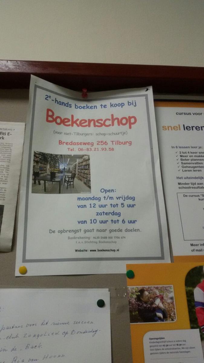
The poster in the picture is from the Boekenschop, which is a small second-hand book shop in Tilburg. It says: '2e-hands boeken te koop bij Boekenschop (voor niet-Tilburgers: schop=schuurtje)' (Second-hand books for sale at Boekenschop (for people who are not from Tilburg: schop = shed). The text is followed by the address, opening hours and some additional information. The different text parts have various font sizes and text colors, but the name of the shop is the largest component. Finally, the poster features a picture of the inside of the book shop. The poster is on simple paper, pricked on a bulletin board between other posters.
The langugae in the poster is completely written in correct standard-Dutch. The name of the shop, Boekenschop is, however, in Tilburg dialect (thus, a minority language). As is indicated on the poster, the word ‘schop’ in Tilburg dialect means ‘schuurtje’ (shed) in standard-Dutch. As the word ‘schop’ means 'shovel' or 'kick' in standard-Dutch, this may cause some confusion for readers who are not familiar with Tilburg dialect. The name of the shop, for them, would mean ‘Book shovel’ or ‘Book kick’. The interesting part about this flyer is this tiny sentence printed beneath the name of the shop, explaining the Tilburg dialct word 'schop' for people who are not from Tilburg. This sentence is printed smaller than most of the text and is in a discrete gray color. Because of this sentence, there are a handful of assumptions that can be made:
- The maker of the poster assumes that only people from Tilburg can understand the Tilburg dialect, as the clarification notice is explicitly aimed at people who are not from Tilburg.
- The maker of the flyer assumes that people from Tilburg can understand the local dialect as, again, the clarification notice is explicitly aimed at people who are not from Tilburg.
- The maker of the poster apparently expects the name of the book shop to cause problems and therefore thinks that explaining the name is necessary or at least useful in order to prevent confusion for people who are not from Tilburg.
Three remarks can be made regarding these assumptions:
- First, although being born and raised in Tilburg, I myself did not know the meaning of the Tilburg dialect wordt 'schop' (shed). According to the online Tilburg dialect dictionary however, the word ‘schop’ is Tilburg dialect and it means 'shed'. So the assumption that only people who are not from Tilburg would have problems understanding the name of the book shop needs some modification: also for people from Tilburg, Tilburg dialct is not necessarily a language they are fully proficient in.
- Second, although the poster explicitly indicates that 'Boekenshop' is Tilburg dialect, it is very well imaginable that also without this notification the message would not have lead to any problems since the English word 'shop', which almost sounds the same as 'schop' is very commonly used in the Dutch linguistic lanscape to refer to a "building, room etc., for retail sale of some commodity or service" (Oxford Dictionary, 1976:1054). The sentence in brackets could therefore also be considered as just a humorous addition that in fact has no other meaning than making fun.
- Third, using a Tilburg dialect name for a book shop might also aim at giving this bookshop some authenticity, i.e. making it really a shop that belongs to the city and wants to identify as such. According to the poster, the profits of the Boekenschop go to charities, probably in Tilburg. Also this contributes to communicating authenticity.
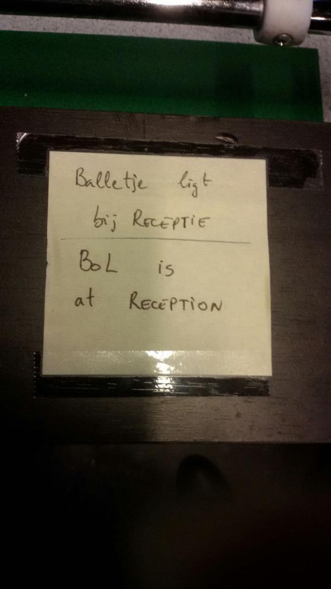
Balletje ligt bij RECEPTIE - Bol is at RECEPTION
 © Manouk Boelhouwers
The above note was stuck to a foosball table in the cafeteria of the Academia building at the campus of Tilburg University. It is hand written in standard-Dutch and standard-English and it says: 'Balletje ligt bij Receptie / Bol is at Reception'
The texts in Dutch and English are written equally big and in the same type of handwriting. However, the Dutch text is placed above the English one. This is interesting, and could mean multiple things. Perhaps English is seen as less important regarding the context, or perhaps the note was first written in Dutch and then translated into English. The meaning of the two texts is the same. They both say that the ball - to be used for playing table soccer - can be found at the reception.
The Dutch text is written without any mistakes but is a bit of a telegraphese, leaving out the articles with 'balletje' and 'receptie'. The latter also applies to the English text. Both texts use a mixture of capital letters (RECEPTIE/RECEPTION) and lower case (in the other words). The English text has an orthographic error: the word ‘ball’ has been wrongly spelled as ‘bol’, a mistake presumably caused by the fact that the English pronunciation of the word ‘ball’ resembles that of the Dutch word ‘bol’.
The sender of this message is most likely a staff member of Tilburg University who works at the reception of the Academia building. The audience consists of those who want to play table soccer, as the message informs one about the location of the ball needed in order to be able to play. The informal context of the message, i.e. written by an individual employee and not belonging the the official announcements issued by Tilburg University to its students on a regular basis, could explain the language used on the note. First of all, the international audience (international students studying at Tilburg University) requires the message to be in English next to Dutch. Since it is an informal message, it does not necessarily require accurate spelling, language use, nor grammar. It is, however, strange that in the multicultural environment of a university that opts for English in addition to Dutch as its main language of communication, and with the easy and fast online translation machines one has access to these days, the message was not translated into English correctly. Perhaps the incorrect use of ‘bol’ was even an intentional stab at non-Dutch speakers, exemplified by the placement of English under Dutch
AD NIE G OEVE !
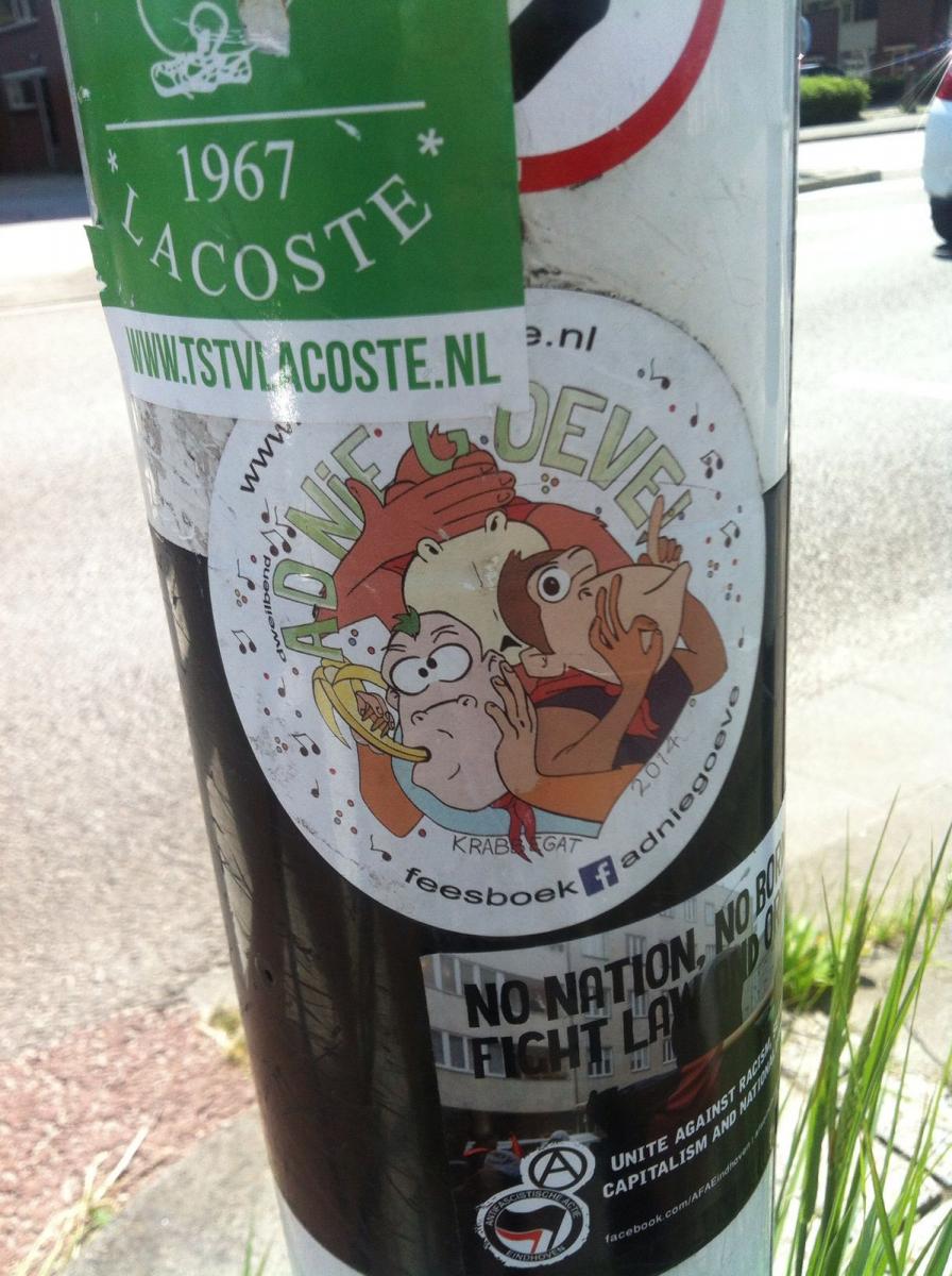
The round sticker in the middle of the picture above was found on a street lantern near Tilburg University. It contains text and images. It shows three monkeys. In large green letters it presents the text ‘AD NIE G OEVE’, which apparently is Bergen op Zoom dialect for ‘had niet gehoeven’ (‘was not necessary’). Underneath the monkesy is says ‘KRABBEGAT 2014’, which is the carnaval name for Bergen op Zoom and a reference to the year in which the carnival association was established (Adniegoeven, 2016). At the bottom is a text that says ‘feesboek (F) adniegoeve’, which is a link to their Facebook page. At the top of the sticker (which is partly covered), the website address of the orgainzation is mentioned: www.adniegoeve.nl. Furthermore, the sticker is decorated with music notes and confetti. Around this sticker, there are several other stickers of other associations, activities and events. These are all different and not interrelated; the only connection is that they are pasted on the same lantern. The sticker of 'Ad nie g oeve' might have been posted already for a while, because it is partly covered by another sticker (Lacoste).
The sticker is produced by a carnival band from Bergen op Zoom named ‘Ad Nie G Oeve’. They specialize in ‘dweilmuziek’ (mop music), according to their Facebook page. Everything on this sticker embodies the carnival spirit. To start with, the texts on this sticker are all in Bergen op Zoom dialect. During carnival time, a sense of community is celebrated and dialect is a large part of this. Therefore, during carnival, the names of towns and villages are temporarily changed into dialect. Bergen op Zoom changes into Krabbegat. The first part of this name refers to a plant (Meekrab), which was cultivated in the town and was used as a raw material for a red pigment. The second part ('gat') is a derogatory term for a small village.
The link to the Facebook page is written in a peculiar way as 'Feesboek'. This is not only an orthography-related action that refers to the way in which the pronunciation of 'face' would be written in Dutch or dialect, it also gives a special menaing to facebook since 'fees' (correctly spelled 'feest') in Dutch means party. It is Partybook, rather than Facebook, which again stresses the carnival theme of the sticker. The band is not only visible in the offline world of the linguistic landscape, but also in the online world through Facebook and their Website pages. On their Facebook page, links can be found to their Twitter and Instagram accounts. On their Facebook page, they state in their local dialect: 'Laike vor 'n sticker!' (like for a sticker). The silliness of the sticker and the logo with the monkeys is also appropriate for the carnival theme and expresses the band's authenticity and their identity as belonging to the community of musicians and others who celebrate carnival in Bergen op Zooms / Krabbegat.
Conclusion
Now that we have analyzed several bottom-up signs in and around Tilburg, we can come to a comparison and an overall conclusion. As expected, we found different types of signs, each with individual characteristics. Even though all signs were found in (or around) Tilburg, each sign shows its own individual background. Not only did we find signs that were typical to Tilburg, such as those containing (Tilburg) dialect that communicate an atmosphere of authenticity, we also found examples of multilingual signs, referring to internationalization. We furthermore observed some cases of audience design, in which the makers of the sign, primarily thought about their audience when producing it. Hair salon Je Weet Zelluf accomplished this by referring to a song that is probably popular amongst their clientele, and that also represents a common expression in their culture. The 'no entry' signs accomplished this by using well-known authoritative signs to convey the legitimacy of their messages to any possible audience. And the 'balletje - bol' sign considered its audience by (wrongly) translating their message into English in order to include an international audience. This shows that the various producers of the signs all thought about their audience when making the sign, but used different techniques in order to accomplish their goals.
One can conclude that language choice is a recurring theme in the signs. In all signs, a certain choice has been made about which languages to in- and exclude. In some cases this language was Dutch, in some cases local dialect and sometimes English or even French. It is interesting to compare the reasons as to why this choice was made. In some cases, the notion of authenticity seems to have had an influence. Since this paper deals with signs in and around Tilburg, locality is a recurring theme, which is closely linked to authenticity and local identity. The producers of the carnival band sticker 'Ad nie g oeve' wanted to stipulate their local identity. This is similar to 'Ons hûske' and the ‘Boekenschop’, where the use of dialect acts as an index for local identity. All three signs contain dialect. The presumed reason for this choice of language in these cases is authenticity, in which using the dialect pictures the sender of the message as an authentic member of the corresponding social community; in these cases, the sender identifies him or herself as being an authentic Tilburgian.
Sometimes in homemade signs, things seemingly go wrong. This is the case in the 'private property', 'honden-liefhebbers' and 'balletje-bol' signs. Mostly this goes wrong in translation or in the use of words. In the 'private property' sign something went wrong in the use of an international traffic sign, meaning 'no vehicular traffic from both sides' but used as a 'leave exit free’ sign. In the 'honden-liefhebbers' sign there is a small (probably conscious) mistake in the use of a hyphen which makes the sign addressing the dog-owners instead of the dogs. In the 'balletje - bol' sign these mistakes might both occur. Here, ‘balletje’ is translated to ‘bol’, which is a phonetic spelling of the English ‘ball’ which, again, is a mistake that could hint at the lack of English proficiency in the maker of the sign.
The 'private property' sign and the 'balletje - bol' sign feature foreign languages, French and English respectively. The choice of these languages is once again interesting and raises the question as to why these choices were made. For the 'balletje - bol' sign it can be said with quite some certainty that English was used since Tilburg University is an essentially multilingual environment. The 'private property' sign doesn’t allow such a simple a conclusion. There may have been a situation in which the French traffic sign was the only one available for communicating the message, or perhaps the makers of the sign want to show off by using a French sign. This is still up in the air.
The examples exhibited in this paper show how language choice reflects the homemade character of signs. The visibility of this relationship is quite an important aspect of homemade signs, as these signs are usually produced by individuals or small businesses and are meant for rather small audiences. The signs are not recurring nor are extremely visible as big marketing companies’ signs often are, which leads to homemade signs being much more tied to and pointed at their immediate environment. They are a creative reflection of local identity.
References
Adniegoeven.nl (2016). Adniegoeven Tuis page on adniegoeve.nl. Retrieved from: Ad Nie G'oeve Webpage(last retrieved on 8-6-2016)
Adniegoeven (2016). DB Ad Nie G’oeve. on facebook.com. Retrieved from: Ad Nie G'oeve Facebook Page (last retrieved on 8-6-2016)
Ali B ft. The Opposites (2007). Je weet zelluf on youtube.com. Retrieved from: YouTube- Video 'Ali B ft. The Opposites - Je weet zelluf' (last retrieved on 8-6-2016).
Songtekst retrieved from: Songtexten (last retrieved on 8-6-2016)
Department of Transport (2016). Traffic Signs - The Highway Code on gov.uk. Retrieved from: UK Govenrment Website (last retrieved on 8-6-2016)
Funda in Business (2016). Winkelpand te huur: Korvelseweg 30 on fundainbusiness.nl. Retrieved from: Funda in Business (last retrieved on 8-6-2016)
Je Weet Zelluf kapsalon (2016). Je Weet Zelluf kapsalon facebook page on facebook.com. Retrieved from: Je Weet Zelluf kapsalon Facebook Page (last retrieved on 8-6-2016)
Mijn Woordenboek (2016). Dialect Vertaler of the word ‘Huisje’ on mijnwoordenboek.nl. Retrieved from: MWB Mijnwoordenboek-'huisje' (last retrieved on 8-6-2016)
Mijn Woordenboek (2016. Dialect Vertaler of the word ‘Schuur’ on mijnwoordenboek.nl. Retrieved from: MWB Mijnwoordenboek- 'schuur' (last retrieved on 8-6-2016)
Mijn Woordenboek (2016). Tilburgs dialect on mijnwoordenboek.nl. Retrieved from: Mijnwoordenbook- Tilburg Dialect (last retrieved on 8-6-2016)
Oxford Dictionary (1976). The Concise Oxford Dictionary of Current English (sixth edition). Oxford: Clarendon Press.
Van Herk, G. (2012). What is Sociolinguistics? Chichester: Blackwell Publishing.