
Coffee places in Tilburg as linguistic landscapes
We were sitting in Beans & Bites in Tilburg, drinking our coffee and looking at the menu, when we realized that we were sitting in a real linguistic landscape. Coffee places are not only places to socialize and enjoy a good cup of coffee; they are also landscapes that are host to forms of cultural expression. There is more to coffee places in Tilburg than meets the eye: they are diverse and complex, and there are interesting stories to uncover in them.
In this article, we will investigate three coffee places in Tilburg that are in some ways similar, but in other ways completely different: Stoom 013, Brownies &downieS, and Mr. Morris. The coffee places are located in different spots around the city as shown in Figure 1. We will be adopting the analytical framework of LLA (Linguistic Landscape Analysis) by using the three analytic perspectives or "arrows" (to the past, present, and future of signs) to examine what visible language in public spaces says about a particular area. The overall perspective is that in times of globalization, visible language and other semiotic signs reflect the mobility of people, languages, and cultures.
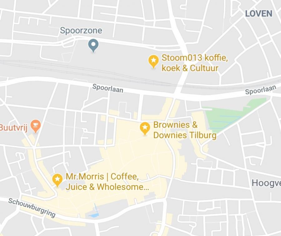
Figure 1. Map of the center of Tilburg showing Stoom 013, Mr. Morris, and Brownies&downieS.
The story of Stoom 013
Stoom 013 (Figure 2) is located in De Spoorzone (the Rail Area), close to the train station. The area had been a workspace for the Dutch Railways (Nederlandse Spoorwegen, NS) until they sold the site to the municipality of Tilburg in 2010. The municipality decided to turn it into a breeding ground for creative pioneering, of which Hall Of Fame, a cultural workspace, is a good example. Behind this center is where Stoom 013 opened. It started as an adventure for Bob Caarels and Lucas Willem Fikken, two friends who wanted to start their own coffee place. Next to Hall Of Fame stood an old train wagon which had not been used for years. Since the center had not yet found a purpose for it, the vehicle was donated to Caarels and Fikken so they could realize their dream. There was much work to be done, the wagon was in bad shape and needed to be changed into a catering facility, but in the end, Stoom 013 opened its doors on April 28th, 2017.
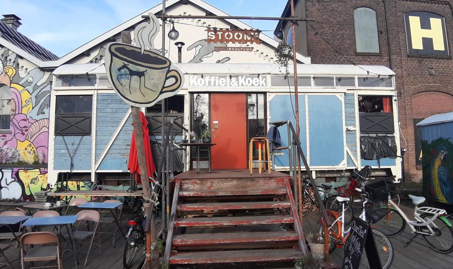
Figure 2. Coffee bar Stoom 013, Burgemeester Brokxlaan 6, Tilburg. Picture taken on 22 November 2019.
Name and logo
The coffee place's name is a combination of the noun "stoom" (Dutch for "steam") and a series of numbers, "013". The use of the word "stoom" is a reference to the steam that used to be produced by trains, as the coffee place is, in fact, an old train compartment. The second part, "013", could be interpreted in any language's terms, but because the first part of the name is in Dutch, it is safe to consider 013 also as Dutch. 013 is a symbolic reference as well. In fact, the reference relates to Dutch reality. Just like any city in the Netherlands, Tilburg has a prefix code for telephone numbers and it happens to be 013. So, you could say that the name Stoom 013 points to and thus is indexical of its history and its location.
The name Stoom 013, is also part of the coffee place's logo (Figure 3), in which it is placed between two lines. Underneath it, there is a subtitle that says "- koffie en koek -", which is Dutch for "coffee and cookie". The name and the reference to the products have been placed in front of a graphic drawing of the front side of a locomotive. The words are written in bold capital letters. The logo is white and is placed on a light blue background, on the right of the side of the wagon. The name and logo, combined with the shape of the coffee bar (a train wagon), construct Stoom 013’s arrow to the past, in LLA terms, as they point to the history of this space.
On the same side as the logo, you can find the coffee place’s opening times: "OPEN VAN 8.30 T 17.30" (Figure 3, upper left corner). Next to them is a painting of a coffee cup with wings. We could reasonably hypothesize that this is also meant as a nod to the wagon’s past, since an old sign from the (international) railways is a winged wheel, which was also the logo of the NS until 1946.
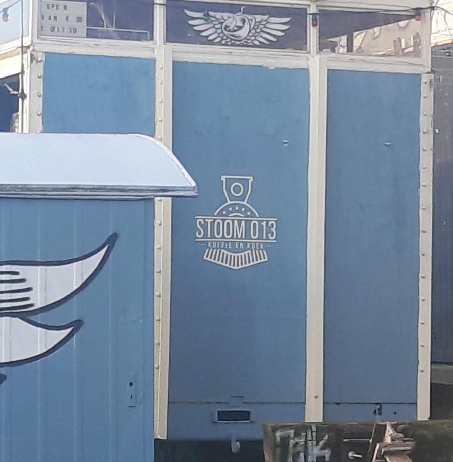
Figure 3. The logo of Stoom 013. Picture taken on 22 November 2019.
Other semiotic signs
Besides the name and the company's logo, there are also other semiotic signs that draw the attention of customers. Above the stairs that lead to the entrance hangs a metal plate in the shape of a set of train tracks. This sign also displays the name Stoom 013, while underneath it is another sign that says "koffie cultuur" (coffee culture)(see Figure 2 above). A sign above the door says "Koffie & Koek", letting passers-by know that this is a place that serves coffee and cookies (Figure 2). Both words begin with a capital "K" and are presented in white. On the door, just above the doorknob, a silver-colored plate is placed that says "trekken" (pull).
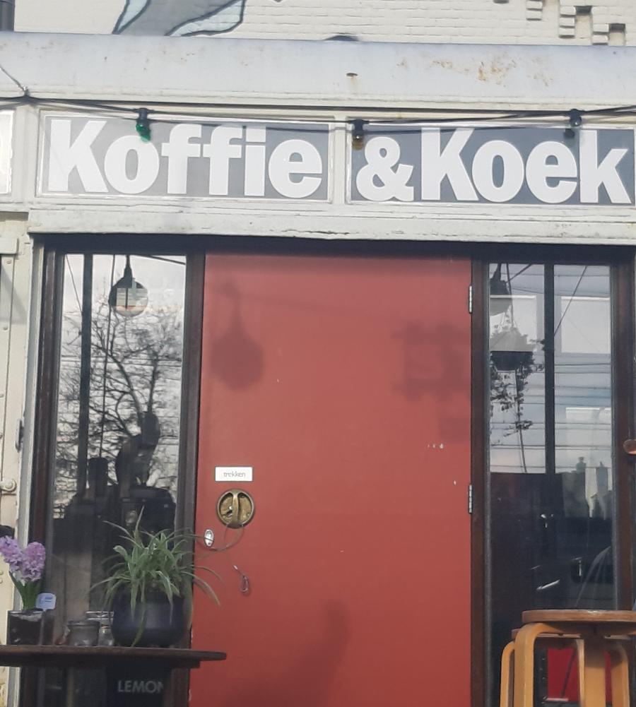
Figure 4. "Koffie & Koek" sign above the door of Stoom 013. Picture taken on 22 November 2019.
Inside the wagon is a black chalkboard. In white handwriting, you can read which coffees, teas and other drinks you can order, accompanied by their prices. This menu (Figure 5) is mostly in Dutch, but there are also English words like "vegan" or "special" and globally-recognized coffee names. At the top of the board, you can read the words "Stoom 013", "Specialty", "Coffee" and "Tilburg".
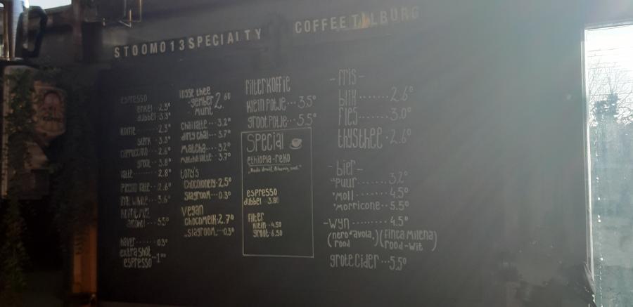
Figure 5. The menu of Stoom 013. Picture taken on 22 November 2019.
The signs described above shape the arrow pointing to the present, the emplacement of Stoom 013 as coffee place in modern-day Tilburg. And because these signs feature a combination of language and other ways of making meaning, the linguistic landscape of said coffee bar is multimodal.
Customers
Based on the fact that both Dutch and English are present in the linguistic landscape of the coffee place, you could argue that it addresses local and international people. However, the majority of signs are in Dutch, meaning that the coffee place's customers are supposed to be literate in Dutch. They also need to be somewhat familiar with the city of Tilburg and have knowledge about certain areas, especially the Spoorzone area, because otherwise, they would not be able to find this particular coffee bar.Stoom 013 is an attractive place for tose that have a taste for non-chain little shops and coffee places.
This coffee place can be considered "green" because it serves artisan coffee and home-made cookies made from fair-trade and biological products. All ingredients come from local sources so that they can be picked up preferably by bike. So, another indexical is caring about the environment and about authenticity. The following signs point to that index and the type of customer that Stoom 013 attracts based on its profile.
Above one of the windows, there is a neon sign that reads "Bocca" (Figure 6). Stoom 013 uses Bocca beans to make its signature coffees. Bocca Coffee is an Amsterdam-based coffee brand that roasts and trades organic fair-trade coffee beans from Africa, Central America, and South America. Bocca owns the entire production chain of its coffee and works together with its farmers to make sure they get a decent price for their product. The word "bocca" means mouth in Italian; however, as we did not get an answer from the company as to why their product is named "Bocca Coffee", we cannot say what the story behind the name is.
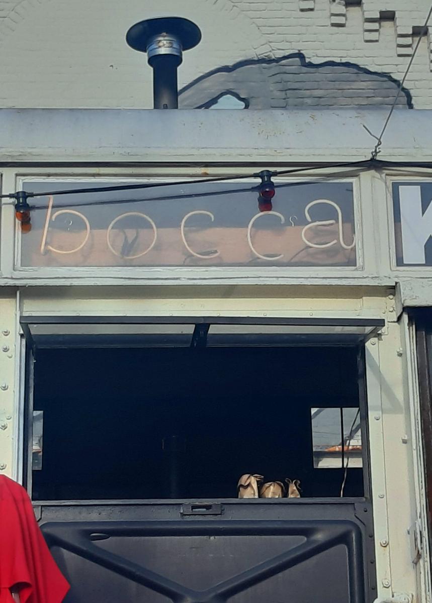
Figure 6. "Bocca" sign above one of the windows of Stoom 013. Picture taken on 22 November 2019.
Near the entrance is a cup of steaming coffee with a drawing of an animal on it (Figure 7). It looks like an Ethiopian donkey, often used by farmers to work the land. As many of the coffee beans from Bocca are harvested in Africa, and especially in Ethiopia as that is where Bocca’s story began, it is reasonable to argue that this sign points to the origin of the coffee that is served at Stoom 013. Even more so, if we take another look at the menu in Figure 5, we'll see that one of the special drinks is "Ethiopia-reko" coffee.
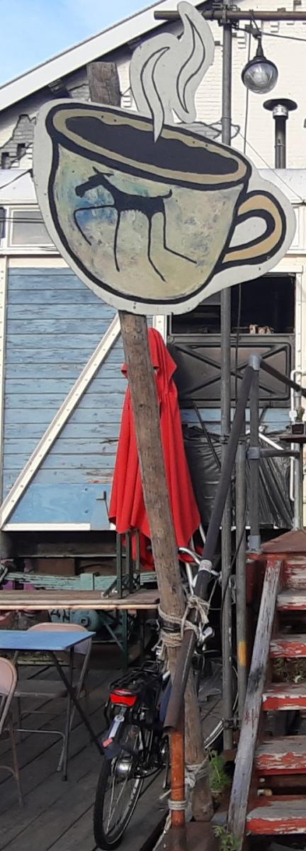
Figure 7. Sign of a hot cup of coffee with an animal on it. Picture taken on 22 November 2019.
On the other side of the stairs, there is a board that says "ChariTea" (Figure 8). ChariTea is a tea company based in Hamburg, Germany. It produces and sells fair-trade and organic tea and iced tea. The sign also says "fresh coffee to go", indicating that customers can not only take a seat to have their fair-trade cup of coffee or tea, but they can also grab a cup and take it with them on the road.
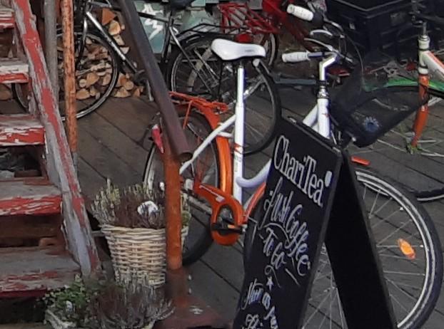
Figure 8. Board sign displaying the logo of "ChariTea" and advertising fresh coffee to go. Picture taken on 22 November 2019.
These signs point to the vision of the coffee place and make up the future perspective of Stoom 013, the third "arrow" in our analysis, meaning that they address the intended customers who come here for their favorite cup of artisan, organic coffee or tea.
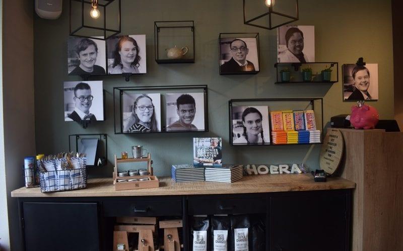
Figure 9. The wall with pictures of employees in Brownies&downieS, Tilburg.
The story of Brownies&downieS
The story of the Brownies&downieS café started in a very special place, namely the Bernadette School in the town of Oss. The Bernadette School is a place for people with special needs, where the owner of the cafeteria, Thijs Swinkels, did an internship. At the same time, he had a side job as an assistant cook at Hutten, a large catering company in Veghel. After his internship, Thijs wanted to do something that would combine his experience at the school and his love of cooking. He came up with the idea of a cafeteria in which there would be a place for people with intellectual disabilities to work. Thus, the connection between the Bernadette School and owner Thijs Swinkels constitutes the past of Brownies&downieS.
After months of preparation, the first Brownies&downieS opened in Veghel, in 2010. The concept enjoyed enormous success despite all kinds of difficulties. The high-quality dishes in combination with the unique service created a new concept for this branch in the Netherlands. The coffee place grew over the years and by now there are 40 Brownies&downieS cafeterias throughout Holland. It was through this expansion that the Brownies&downieS in Tilburg opened its doors in April 2018.
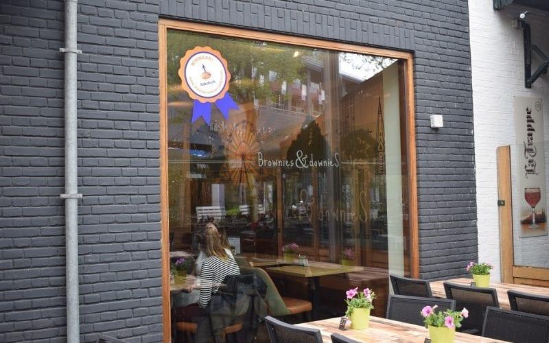
Figure 10. The logo of Brownies & downieS in Tilburg.
Name and logo
Looking at the past arrows of Brownies&downieS, we can first note that the name functions also as a logo for the cafeteria. Figure 10 shows the front window of Brownies & downieS where the logo of the cafeteria is displayed, and it features an interesting meaning. The name can be analyzed by dividing it into two parts. The first part is the word brownies, which refers to the dessert: the coffee place aims it makes the best brownies. The second part is the word downies; "downie" is a slang word referring to a person with Down syndrome. Half of the employees in Brownies&downieS are people with Down syndrome.
The logo, like any sign, is multimodal. This means that there are different elements to the signs such as language, colors, and shapes that operate to improve the audience’s reception of the text (Blommaert, 2016). Therefore, we need to zoom in on "downieS" in order to examine why it has a capital "S". The indexical meaning could be that S refers to "syndrome" or it might mean that the cafeteria wanted to underline the word as a plural due to the fact that there is more than one person with Down syndrome working at any given Brownies&downieS.
Furthermore, the cafeteria could be inspired by Amsterdam ArenA, which also features this specific style of writing in its logo, playing with the symmetry of capital letters at the beginning and end. Amsterdam ArenA is the main sports stadium in Amsterdam. Before the 25th of April 2017, its logo was "Amsterdam Arena", but on that date the stadium changed its name to "Johan Cruijff Arena" in memory of Ajax legend Johan Cruyff (Wikipedia, 2019), and therefore its logo changed as well. From "Amsterdam Arena" to "Amsterdam ArenA" with a capital "A" at the end, which aimed at underlining the fact that the legendary football player John Cruyff was not from some random football club, but from Ajax, one of the most popular football clubs in the Netherlands.
Customers
The name of Brownies&downieS constructs the identity of its customers. The coffee place has an American flavor, as they do not just serve brownies, but also make them a central element in their name and logo. The people who made the logo as well as the owner aim to address people who want to have a cup of coffee while eating a delicious American-style brownie, served by a "Downie". Also, as the name is in English, Brownies&downieS tries to be more internationally- than locally-oriented. This could be due to the fact that there are one hundred and two nationalities among Tilburg's residents (Holland International Study Center, 2018) and the cafeteria is located in one of the central shopping districts (Pieter Vreedeplein). It may be more profitable for the business to present themselves in English. Therefore, from a "future arrow" perspective, we can argue that the sign in Figure 10 constructs the identity of potential customers.
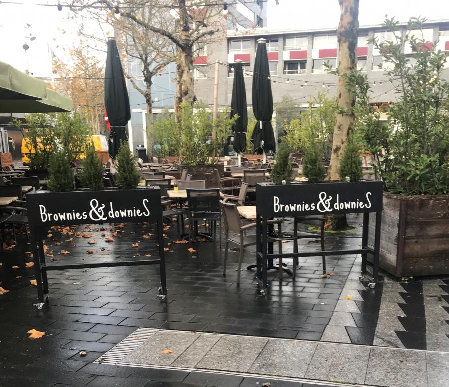
Figure 11. The flowerpots of Brownies & downieS.
Visible signs
In order to analyze Brownies&downieS along the present arrow of LLA, we need to see how the signs are emplaced in the area and what their purpose is, because as Blommaert (2013) states, “signs are placed in a specific space, a nonrandom place, and their emplacement defines their effects.” The square in which Brownies&downieS is situated, the Pieter Vreedeplein, is a shopping center with clothing stores, tech stores, and other cafeterias (e.g. La Place, Lokaal Zeven). Thus, the coffee place needs to place its signs in a way that makes it stand out.
In order to catch the attention of customers, Brownies&downieS decided to display its logo sign on the front window, as we already saw (Figure 10), while there is yet another logo sign outside of the cafeteria, on the sidewalk (Figure 11). However, this particular sign is not like the usual coffee signs that most coffee places have. The visual sign of Brownies&downieS consists of flowerpots, which surround the cafeteria, and the logo is placed on them. It would be rather interesting to know why they decided to present themselves this way, but maybe the reason is that they wanted to show people that they are not a typical coffee place. Further, Brownies&downieS is a modern-style cafeteria and as such, an aesthetic means of attraction is considered more important than a big, massive sign in front.
Mr. Morris
The final coffee place we decided to examine is Mr. Morris. We found it by accident while trying to find a place to drink our Sunday morning coffee. We were surprised by how diverse the customers were. There were students with laptops, families with children, people that sported a hipster-like style, old couples and men in suits.
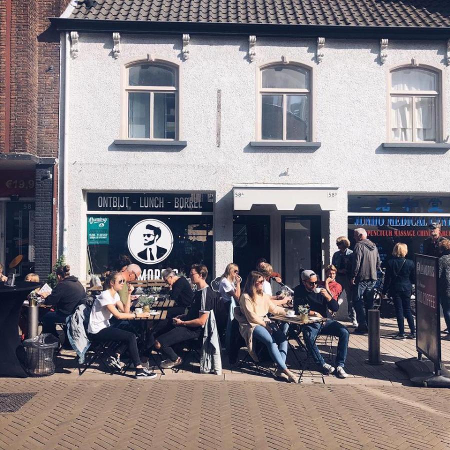
Figure 12. Mr. Morris' outside view, Tilburg.
Mr. Morris is located in Tilburg's city center. We could not, unfortunately, find information about when it opened, but we did find out that it was not founded in Tilburg. The coffee place was originally located near the train station in Eindhoven. According to the last comment made on Tripadvisor, in July 2018 it was still located in Eindhoven. Since we did not receive answers from the management of Mr. Morris, we can only assume that the choice of a central location is profitable for them. Since it is very close to the shopping street and exactly in the city center of Tilburg, it is easily accessible for casual passers-by. Most of us would most probably rather go to the city center for a good cup of coffee than to the edges of the city.
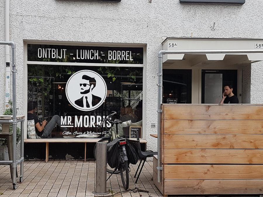
Figure 13: Logo of Mr. Morris, Tilburg.
Name and logo
From a past arrow perspective, the name of the cafeteria, "Mr. Morris", is written in English, but there is no evidence that it is meant for English-speaking people; it might have been used because English is the world's most powerful major language or it just might be intended to look more “hip”. But who is Mr. Morris?
The logo of the coffee place again consists of two parts – the name and a picture (Figure 13). We see the logo of Mr. Morris as identity work. Identity work is viewed here as "discursive orientations towards sets of features that are seen (or can be seen) as emblematic of particular identities" (Blommaert and Varis, 2013). In other words, the logo enables us to construct the identity of Mr. Morris' persona. Analyzing the picture, we can conclude that this persona is a hipster man, because of the glasses, the haircut, and the beard, which are emblematic indexes of hipster culture. However, he is not a traditional hipster, but a modern one as he is obviously wearing a suit. This identity refers to the people who visit the cafeteria, its customers.
Customers
Focusing on the future LLA arrow, the identity of Mr. Morris' persona addresses the customer. The cafeteria is a typical hipster barista space with modern vintage design, and it offers drinks and meals made with local products, served on eco-friendly plates. However, as mentioned above, the place attracts a very diverse public, including hipsters who perhaps want to enjoy an old-style barista coffee and a meal, presented in a trendy fashion, which is perfect to be photographed and posted as a picture or a story on Instagram.
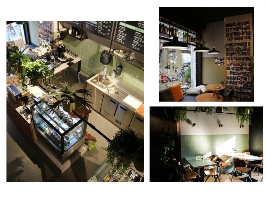
Figure 14: Mr. Morris inside views, Tilburg.
Visible language
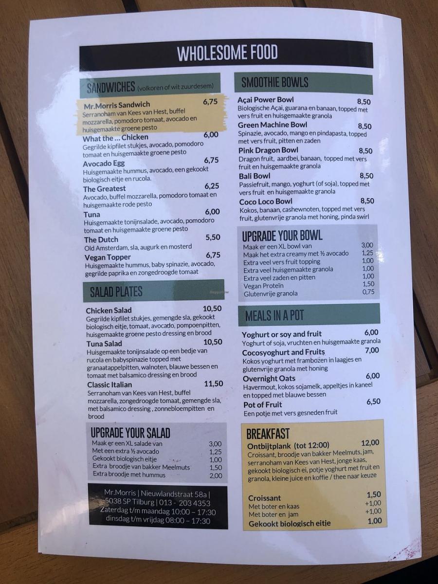
Figure 15: Dutch menu of Mr. Morris, Tilburg.
As we already observed, the name of the cafeteria is written in English; however, if we look more closely at the front window (Figure 13), we see that there is another item of visible language above the logo. The text says “ontbijt-lunch-borrel” in Dutch, which translates as "breakfast-lunch-drinks". It is interesting why the cafeteria has decided to write this text in Dutch, and not only in English. Presumably they wish to present themselves on a local level.
Also, it is interesting that the Dutch menu of Mr. Morris (Figure 15) is not entirely in Dutch. The descriptions of the meals and drinks are in Dutch, as are the opening hours and all additional information, but the names of the meals are in English and are also very unusual. There can be various reasons for this. First, the English language can be used to attract international people. Second, it could be based on the idea that names in English will sound more “hip” than in Dutch. Let’s take a look at the unusual names: “Avocado Egg”, “What the…Chicken”, and “The Greatest”. Meals with authentic or unusual names reportedly attract more costumers than meals with basic or traditional names (Tešanović, Banjac, Kalenjuk & Radivojević, 2016). Therefore, the names of meals might impact the guest’s choice.
Coffee places and globalization
In conclusion, these three coffee places embody some effects of globalization when seen as linguistic landscapes. They are complex, diverse, dynamic, and their identity is visible in multimodal signs displayed in space. Stoom 013, Brownies&downieS, and Mr. Morris have some similarities, such as using English to varying degrees to shape a particular profile. At the same time, they are very different from each other in ways that attract different superdiverse audiences. These cafés can not only be seen as places to get coffee, but also as forms of cultural expression.
References
Blommaert, J. (2013) Chronicles of complexity. Ethnography, superdiversity, and linguistic landscapes. Tilburg Papers in Culture Studies nr. 29.
Blommaert, J. & Maly, I. (2016), Ethnographic linguistic landscape analysis and social change: A case study. In K. Arnaut, J. Blommaert, B. Rampton, & M. Spotti (Eds.), Language and superdiversity (pp. 197-217). Routledge.
Blommaert, J. & Varis, P. (2013). Enough is enough: The heuristics of authenticity in superdiversity. In J. Duarte & I. Gogolin (Eds.), Linguistic Superdiversity in Urban Areas. Research approaches (pp. 143-159). John Benjamins Pub.
Maly, I. and Varis, P. (2015), The 21st century hipster: on micro-population in times of superdiversity. Tilburg Papers in Culture Studies, p.4
Tešanović D., Banjac M., Kalenjuk B. & Radivojević G. (2016). The impact of the names of dishes on the guest’s choice of restaurant food. Resources as a basic for achieving quality and destination competitiveness, 169-173. Retrieved from: DOI: 10.15308/Sitcon-2016-169-173
Wikipedia, 2019, “Johan Cruyff Arena” https://en.wikipedia.org/wiki/Johan_Cruyff_Arena
https://www.browniesanddownies.nl/geschiedenis
https://www.hollandisc.com/blog/categories/university/5-reasons-to-study...
https://www.tripadvisor.com/Restaurant_Review-g188582-d10757886-Reviews-...