
How Semiotic Signs Can Be Both Helpful and Misleading
In this article we will present a linguistic landscape analysis of two stores in the Netherlands - one is a Chinese restaurant located in the village of Schijndel and the other is a French chocolate shop located in the city of Tilburg. In doing so we will use the three perspectives that have been proposed by Blommaert and Maly (2014) for the analysis of semiotic landscape signs. We want to find out why certain semiotic signs are used in certain situations and if these signs reach the goal they were originally intended for. Our linguistic landscape analysis provides us with a first diagnostic of the two stores, which we will then further clarify, elaborate upon, and compare by using the interviews that we conducted with the shop owners.
Semiotic signs on a Chinese restaurant
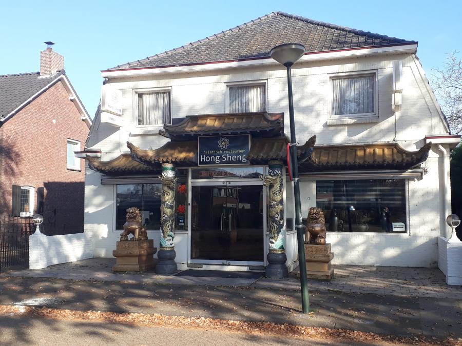
Storefront of the Chinese restaurant 2020
The first store is located in Schijndel, the Netherlands, and is named Hong Sheng. It is a Chinese restaurant. This becomes immediately clear to the viewer due to semiotic signs which provide a visual representation of China at the storefront. This visual representation consists of six elements: the Chinese temple facade, the dragons and the lions left and right from the entrance, the lotus flower on the nameplate above the entrance, the name, and two Chinese characters next to the entrance.
According to Blommaert and Maly (2014), all semiotic signs can be analyzed by looking at three perspectives: backwards, forwards, and sideways. A backwards perspective points towards the past and therefore to the history and origin of the signs. A forward perspective points towards the future and to the expected viewer and their understanding of the sign. A sideways perspective points towards the location and placement of the sign.
Visual representations of China
The first element of the visual representation is the Chinese temple facade. Temples hold much significance in Chinese culture. According to TravelChinaGuide (2019), the restaurant made use of traditional Chinese temple architecture. These structures are seen as valuable art treasures and are symbols of the long and rich history of China. In an interview with the owner, who wanted to stay anonymous, he stated that he made the storefront look like a temple because it instantly makes viewers think of China and Asia. In this way, the owner wanted to make sure that when people saw the storefront, they immediately knew what the restaurant had to offer.
The second element of the visual representation is the dragons. Just like the temple, dragons play a central role in Chinese tradition and are therefore very influential in its culture. The dragons that are often used in architecture are referred to as the nine sons of the Chinese dragon. The dragons that are featured in the restaurant are called Fuxi (Chinese: 负屃). These are seen as the most Chinese dragons (Ho, 2020). The Fuxi is often portrayed to be loving literature and can often be found on the sides of stone tablets with inscriptions (Game Frog, 2009). In the interview, the owner of the restaurant mentioned that the dragons on the storefront did not have any personal meaning to him. He said that he used them for the storefront since dragons are often used as a national emblem of China. This would also help people to identify what kind of food the restaurant offers.
The third element of the visual representation is the lions. Again, lions are highly important in Chinese culture. Traditionally, they are used in Chinese architecture, especially in Chinese Buddhism. The lions are often placed at the entrances of buildings in pairs. Usually, one of the lions is male and is holding a ball, while the other one is female and is holding a cub. These lions are believed to protect buildings from any harmful spirits or people. In the interview , the owner stated that, unlike the dragons, the lions did have a meaning to him. His grandmother, who inspired him to open the restaurant, believed that the statues would protect the building from any harmful spirits or people entering, in accordance with Chinese tradition. In addition to that, the lions also add to the visual representation of China on the storefront.
What we did find interesting was that the lions at the restaurant both appear to be male, since they are both holding a ball. This could refer to the fact that the owner of the restaurant is not as connected to China as his family used to be since he and his parents were born in the Netherlands. The placement of the lions has indeed a significant meaning since, as previously mentioned, it is strongly believed that they protect the building from beings with harmful purposes.
The fourth element of the visual representation is the lotus flower. Once more, the lotus flower has many important meanings in Chinese culture, especially in Buddhism. In Buddhism, the lotus flower symbolizes three things: a person emerging from the mud but not being stained, purity, and the fruit, flower, and stalk represent past, present, and future (Mack, 2019). The owner said that he used the lotus flower in the logo because it is very important for Buddhists and people of Chinese descent, as it is said that Buddha himself floated to earth on a giant lotus flower.
The fifth element of the visual representation is the name, Hong Sheng. The (Dutchified) name Hong Sheng refers to Hung Shing (Chinese: 洪聖), a deity in Chinese folk religion who, in his lifetime, was a government official named Hung Hei (Chinese: 洪熙) in the Tang Dynasty. He studied astronomy and geography. His devotion to work caused his young death. According to legend, Hung Shing continued to guard people from natural disasters after he died. The owner of the restaurant stated that he himself had no personal connection to Hung Shing. His grandmother, however, did have a connection to Hung Shing, therefore he decided to name the restaurant after him. It is worth mentioning that this sign is monolingual since the name is only in Dutch transliteration.
Above the name of the restaurant is written ‘Aziatisch restaurant’, which is Dutch for ‘Asian restaurant’. Under the name is written ‘Chinees restaurant’, which is Dutch for ‘Chinese restaurant’. This shows that the restaurant sells Asian food but specializes in Chinese food. Examples of this can be found on the menu. For example, the restaurant sells sushi, which is Japanese and therefore Asian. The restaurant also sells typical Chinese food like spring rolls (also known as egg rolls) and chop suey. Moreover, we noticed that the menu is completely Dutch. The owner stated in the interview that this is because they only get Dutch customers, so it was a logical decision to make the menu in Dutch.
The sixth and last element of the visual representation refers to the two Chinese characters next to the door. These characters are 酒, which means wine, and 楼, which means building. These two characters together form the word 酒楼 (Jiulou), which means restaurant. This is one of many Chinese words used for restaurants. The word 酒楼 originates from the Cantonese area where it is still often used, especially in Hong Kong. The word is, however, also used in Mandarin-speaking areas.
Semiotic signs on a chocolate shop
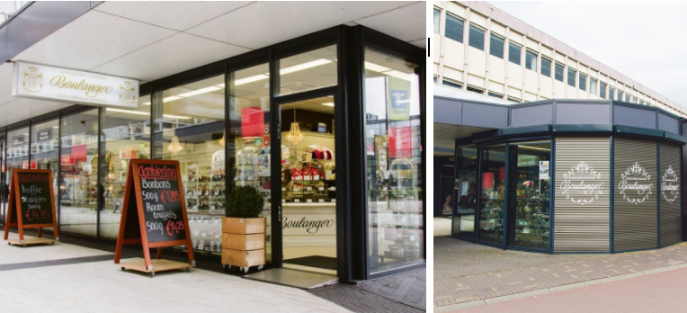
Storefront of the chocolate shop 2020
The second store under investigation is a chocolate shop in the center of Tilburg, the Netherlands, which is named Boulanger as can be seen from the nameplate hanging from the ceiling. There are also two blackboards near the entrance, with some of the products offered in the shop, written down in Dutch. Based on the shop's name, at first sight one would think this is a French shop, since 'boulanger' is a French word. Moreover, if one has a basic knowledge of French, one knows that boulanger means 'baker', and that it is striking that a shop would be called Boulanger instead of Boulangerie (bakery), which might seem more logical. Furthermore, anyone who would think that this is a bakery and decides to go in and buy or consume what is typical of a bakery would find that the only product sold in that shop is chocolate. Therefore, in French, the right name for the shop would be Pâtisserie (pastry), Boutique de chocolat, or Chocolaterie. In any case, we concluded that the name of the shop is confusing and can lead to misunderstandings. This is why we decided to talk to the shop owner to get more information. As we did not manage to find the owner of the establishment, we interviewed two of the managers who were working that day in the store. The first thing we asked was the name of the owner since that could give us a hint about the name of the store. Indeed, the family name of the owner was Bakker, the Dutch word for boulanger, so they confirmed that the store was named after the owner's surname. The owner himself was Dutch and had no connection to France whatsoever. Moreover, with all the products offered inside information is given in Dutch, and in the store’s website, all the information and descriptions are also in Dutch.
Going in-depth
Following Blommaert and Maly’s (2014) three perspectives, in the chocolate shop we can see much less defining symbols than in the Chinese restaurant, where these are abundant. From a backward perspective, the French name of the shop Boulanger is merely a French translation of the shop owner's family name "Bakker". From a forward perspective, understanding this name very much depends on the level of understanding of French that (possible) clients would have. If one were to understand the meaning of the word boulanger, one could expect to encounter in the shop "typical french bread" or “baguette”, among other things. If one doesn’t understand the meaning of this word, one could very well think that this is simply a French shop and that they sell French products. In the store, as mentioned above, all products are sold in Dutch, which would probably confuse a French-speaking person who concluded from its name that the shop would be "in French". The literacy level and orthography used in the signboards, both in Dutch and in French are used perfectly. When looking at the semiotics of the shop from a sideways perspective, from the three signboards at the entrance, we conclude that the only French word used in this shop is actually its name, which at first sight made us think of a bilingual shop when in reality the name is just a translation of a Dutch name. So, the only French aspect of this shop is in fact, the translation, which totally depends on the owner's personal preference. Even in the interior of the store, as mentioned, all products are sold in Dutch, which would probably confuse a French-speaking person who may have thought that the shop would be in French, or maybe even in English due to the multicultural environment expected from reading the name of the shop. On the store’s website, all the information and descriptions are also in Dutch. The literacy level and orthography used in the signboards, both in Dutch and in French are used perfectly.
Multiculturality or not
Comparing the two cases, from the backward perspective, we found out that for the Chinese restaurant, many of the signs have an important cultural and/or historical meaning in Chinese culture. For the chocolate shop, we found out that the name literally refers to a person making bread. From the forward perspective we found out that, for the Chinese restaurant, the semiotic signs were used, either due to the background of the owner or in order to make the restaurant easily recognizable. For the chocolate shop, we found out that the name refers to the owner and not to the products that are sold there. Lastly, from the sideways perspective, we found out that, for the Chinese restaurant, most of the signs were placed in a way that would make the restaurant easily recognizable. Nevertheless, some signs, like the lions, we placed in a specific way due to a cultural belief. The name of the chocolate shop on the other hand only leads to confusion, both regarding what kind of shop it actually is and regarding its linguistic and cultural background.
With these two cases, we can conclude that semiotic signs can both be helpful and misleading to the viewer. In the case of the Chinese restaurant, the signs were helpful since they created a visual representation of China, which helps the viewer immediately identify what the shop is offering. In the case of the chocolate shop, however, the signs were misleading since the name translates to 'baker' which does not refer to the products the shop sells, nor to the cultural background that one may expect by reading the name of the store.
References
Blommaert, J., & Maly, I. (2014). Ethnographic linguistic landscape analysis and social change: A case study. Tilburg papers in culture studies, 100, 1-27.
Chinese Temples Committee. (2019). Deities.
Easy Homemade Sushi. (n.d.). Is Sushi Chinese Or Japanese Food? (Detailed Explanation).
Game Frog. (2009). Facts About Chinese Dragons.
Ho, M. (2020). Chinese Dragons — Facts, Culture, Origins, and Art. China Highlight.
Mack, L. (2019). Importance of the Lotus Flower in Chinese Culture. ThoughtCo.