
Asiana Superstore through the lens of linguistic landscaping
While walking in Korvel, a neighborhood in Tilburg, a shop named “Asiana Superstore” caught our attention. The superstore, which is located in Korvelseweg, sells mainly Asian but also Surinamese and American products. The storefront is quite intriguing since it has many posters and signs with different languages. In this article, we will present a linguistic landscape analysis of the storefront of Asiana Superstore.
Ethnographic Linguistic landscape Analysis
Following Blommaert's and Maly’s (2016) LLS theoretical framework, linguistic landscaping can be used to find out what visual language in public spaces says about a particular area and society in general. Especially in times of globalization, visual language reflects the mobility of people, languages, and cultures. We will describe and analyze the assembly of visual language on the storefront of Asiana Superstore to understand what it says about this particular area of Tilburg. We do so by looking at the past (conditions of production and the producer of the sign), the present (emplacement of the sign among other signs), and the future (conditions for uptake and the addressees of the sign).
In what follows we will specifically focus on the logo, two posters of the storefront (Asian dressings and tea), as well as the shop window. We have selected these posters and signs in particular because they offer the most insight into the store and its indexical meaning. We interviewed the store's owner to gather additional data. What we found is that this particular store reflects the multiculturalism of Tilburg, as Chinese, Japanese, Vietnamese, Dutch, Surinamese and people from other nationalities come here to shop.
Asiana Superstore
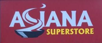 © Asiana Superstore (November 18, 2018)
Figure 1, logo
Figure 1, logo
According to the owners of the store, the name “Asiana” comes from the fact that the products sold are mostly Asian. To this, we can add that they most likely wanted to suggests authenticity, because “Asiana” sounds more original than “Asian superstore."
Nevertheless, an internet search for the name “Asiana Superstore” made us realize that the name "Asiana" is not at all uncommon. In fact it is used in many parts of the world other than the Netherlands. First, there is the airline company “Asiana Airlines” (based in Seoul, South Korea). Then, in London, we find Asiana wedding magazine and Asiana restaurant. Following the same line of this Asiana Superstore, we can also find Asiana Ltd, in Nottingham, an Asian food product importer. Other supermarkets are based in France (Asiana Supermarché) and in the United States (Asiana Market). Many more can be just as easily found under the search “Asiana” on Google Maps.
As indicated above, we can analyze any visual language using three arrows or perspectives. We will begin with the arrow pointing to the future. As the name “Asiana Superstore” suggests, the owners are addressing (and they want to appeal to) people trying to find Asian products to buy. Considering that Asia counts more than 49 states (Wikipedia), the audience is big.
As for the arrow pointing to the past, we have found that the logo was made by an accountant. But there is more to it: we found the same “S” of “Asiana” on packages of spices which come from another store: “Sang Lee”. Sang Lee is based in 's-Hertogenbosch (a city near Tilburg), and in talking to the owners a second time, we found that Sang Lee is the family name of the owners of both shops in The Netherlands.
Moreover, the logo is, as most signs are, a form of multimodality. This means that there are different elements to the signs such as words, colors and shapes that operate to improve the audience’s reception of the text (Blommaert, 2016). Here, the written language is supplemented by the image of a bowl of noodles, of which the smoke coming off of it creates the letter S, while the choice of the color red is due to the fact that Asian people generally like it.
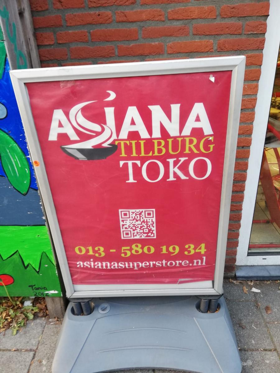
figure 2, outside sign
Regarding the arrow pointing to the present, it is notable that the street in which Asiana Superstore is situated (Korvelseweg) has many other supermarkets and drugstores (e.g. Günes Market, Wisla Supermarkt). This means that it is important to place the shop sign in a visible way. As Blommaert (2013) writes, “signs are placed in a specific space, a nonrandom place, and their emplacement defines their effects.” In order to catch the attention of passerby, Asiana decided to showcase a sign outside of the store as well, on the sidewalk (Figure 2).
On this sign, we can read the word “toko”. This term is interesting since it has Indonesian origins, where it stands for “shop” or “store” of any kind. This in turn probably derives from the Chinese loan-word 土庫 (thó͘-khò͘, literally “private storehouse”) used to refer to a shop (Wikipedia, 2018). However, in the Netherlands “toko” is a specific shop or restaurant that mainly sells Asian food products, as in the case here. This is due to historical circumstaces: tokos have become common in The Netherlands since the repatriation of Dutch colonial expats and Indo-Europeans after the Indonesian revolution in the late 40s and early 50s (Wikipedia, 2018).
A Surinamese touch
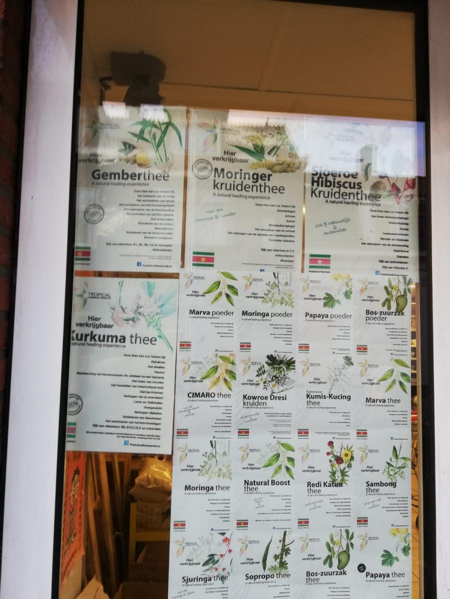
figure 3, Surinamese Tea Posters
A section of Asiana’s front window is filled with posters advertising a specific brand of tea: ‘Tropical Caribbean products.’ As the name suggests, this is not an Asian product. It is a Surinamese product, as the dozens of little Surinamese flags indicate.
The posters have pictures of often green, and sometimes colorfully flowered tea leaves. This gives the posters a fresh and ‘healthy’ look on the whole. There are also lists of five to ten diseases that the specific tea supposedly helps prevent, adding to the ‘healthy’ image. The names are written in bold letters and are, together with the word ‘thee’, larger than the other words. This attracts attention and immediately lets the viewer know what product this is.
The advertisements are all written in Dutch, with the exception of the lines ‘Product of Surinam’ below each of the little flags and ‘A natural healing experience’ below the names of the teas. The fact that Surinam’s official language is Dutch, might be the reason why the advertisements are in Dutch – although this might also be accounted for by the fact that the small retail company ‘Tropical Caribbean products’ is actually located in Barendrecht, NL. It leaves some questions regarding the products’ authenticity. The choice to mix Dutch with English – especially below the flags – might be to appear more international and therefore authentic. Thus, the aforementioned arrow pointing to the past, here points toward this little Netherlands based company.
But why are these ads so prominently featured on Asiana’s front window? To this question, the owner answered: ‘Because it’s a new product’ – but there is a little more to it than that. As we have learned, the owner himself is Surinamese-Asian. Part of the store’s product line is Surinamese and so is a percentage of its customers. Thus, the little flags are an instantly recognizable feature for Surinamese passerby and customers, which makes them the intended audience. However, the choice to feature these Dutch ads, emplaced among primarily Asian posters, is not without reason either. Indexically, this says: “We might be an ‘oriental’ store, but don’t be shy to come in if you’re Dutch.” This expands the intended audience, or the arrow pointing toward the future, to include Surinamese and Dutch people.
A quick Google-search further taught us that the product is not uncommon among Tokos and other Asian-oriented places. This implies either that Asian shoppers are overly interested in Surinam's herbal teas, or that these kind of Tokos and Superstores,which are often situated in multicultural neighborhoods, try to supply to a variety of people from smaller nationalities who want goods that they won’t find at Albert Heijn.
An Asian twist
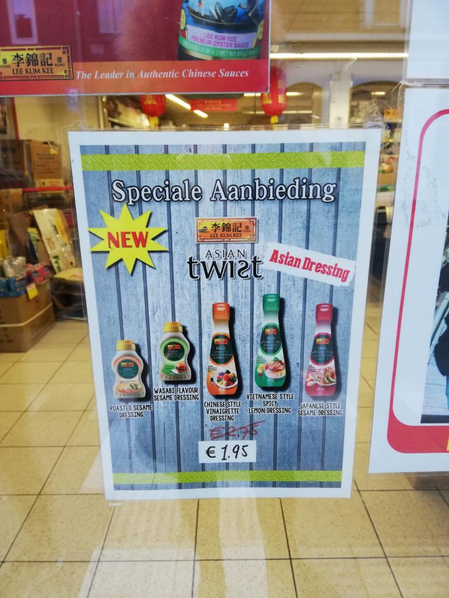
figure 4, Asian Dressings poster
Before entering the supermarket, you will notice a poster for Asian Dressing products from the company Lee Kum Kee. Lee Kum Kee is a food company based in Hong Kong, which specializes in Chinese and Asian sauces (Lee Kum Kee, 2018).
The poster contains three different languages: Chinese characters (with Latin alphabet) (‘Lee Kum Kee’, ‘Hong Kong’), Dutch (‘Speciale Aanbieding’, which means ‘special offer’), and English (‘New’, ‘Asian Twist’, ‘Asian Dressing’, and all the different types of dressing). The Latin alphabet is used to write Chinese, which is called Romanization of Chinese. This way, foreigners who are not familiar with reading or writing Chinese, can recognize what the poster says. The Romanization of Chinese is also a tool to clarify pronunciation and make it easier for people who do not speak Chinese (dialects). Choosing the Latin alphabet makes the poster more accessible for visitors to read and understand. We can once again recognize multimodality: the Latin alphabet creates indexicality, and helps with reaching a wider (and different) audience.
The background of the poster shows blue and grey vertical stripes, with green horizontal stripes at the top and the bottom. Green in a supermarket is usually associated with fresh and healthy products, but the color can also mean life, nature, energy, and fertility (Bourncreative, 2018).
The poster gives more attention to some words than others, depending on the different background color or different fonts (in this case, six) and font sizes. The word ‘Asian Twist’ - in the middle - is interesting because not only are the two words in two different font sizes (‘twist’ is bigger than ‘asian’), but the word ‘twist’ itself reflects a twist by inverting the letter 's'.
The way all the words are showcased on the poster leads to the following analysis: ‘New’ and ‘Speciale Aanbieding’ are ways to attract people’s attention; ‘Lee Kum Kee’ and ‘Asian Twist’ are information about the company; ‘Asian Dressing’ and the pictures of the different dressings are to show what the product is about, and the (reduced) price in euros is informative for interested buyers. If we go further with analyzing we see that this poster perfectly fits the assortment of the store, since they sell mostly Asian products. The usage of different languages has to do with reaching a wider audience, as the store especially tries to include students who cannot read Dutch. In other words, the language on the poster does not only have a referential meaning (giving information about the Asian dressings), but also an indexical meaning with a social/cultural factor: showing visitors that the store is not only available for people who can read Dutch, but that they are welcoming speakers of other languages as well.
The reason for putting the poster near the front door is to attract customers and raise awareness for a new product. As the owner said: ‘It’s a new product and if people see it, they may come inside’. The producer of the poster is presumably the company behind the Asian dressings (Lee Kum Kee). The sign addresses people interested in Asian dressings, and since most visitors are Asian, getting their attention is possibly successful. Looking at the emplacement of the poster among other signs, it may be difficult for it to really stand out since the poster is surrounded with many other posters and signs, but with the help of the pictures of the dressings, the poster is definitely notable.
Not exclusively Asian
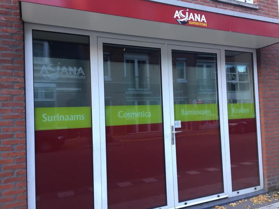
figure 5, Front Window (1)
By passing Asiana Superstore it is easy to see the printings on two of the shop windows. These refer to the products that are sold inside. The text is in Dutch (so, it is monolingual) and it reads Surinaams (Surinamese), Cosmetica (Cosmetics), Bamisoepen (Bakmi soups), Kruiden (Herbs), Dranken (Drinks), Kant en klare gerechten (Ready meals), Rijst-Thee (Rice-Tea). At first, since the text is only in Dutch, it seems that they are welcoming Dutch people only. A further analysis however shows that the words “Surinaams” and “Bamisoepen” are easy to understand for international people as well, as the translation of them is similar to Dutch.
Even though the store mainly sells Asian products, they list common products used by anyone, such as cosmetics, herbs, drinks, and rice. This indexes that they are trying to expand their customer range.
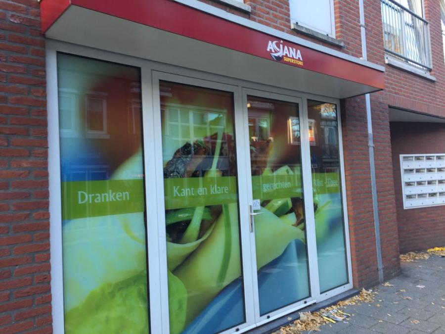
figure 6, Front Window (2)
The colored stripe on the front windows is green and one front window has a duck spring roll as a background image, while the other one is red. As the shop owner explained, Asian people like duck spring rolls and “if they see it on the front window, they might come in.” A quick google search shows that duck spring rolls originate from China, which could indicate that they are aimed not only towards Dutch people but also to Chinese people. The choice of the color green, according to the shop owner, refers to “freshness and more healthy products.” The color red is bright and easy to notice and as the shop owner said, “most Asian people like red.”
Although the poster is in Dutch, the percentage of Dutch people shopping at Asiana is rather small, stated the owner. The majority of customers, according to the owner, are Asian while the rest are Surinamese.
What the linguistic landscape tells us
As we have seen, signs in social space tell us a lot about the users of the space, how users interact with signs, and how users influence and are influenced by them. They tell stories about the cultural, historical, and social backgrounds of a certain space (Blommaert, 2013).
From the logo, we found that the supermarket is Asian oriented, and that “Asiana” is quite a common name. But the store seeks to attract a wider audience than just Asian people. This goal is reflected in the choice of posters on the storefront, which shows different languages such as Dutch, English, and Chinese. It is also reflected in the products they sell. For example, the wide selection of Surinamese tea.
The multilingualism of the store is representative of the superdiverse neighborhood that is Korvel, which is a consequence of the current state of globalization. Globalization affects every part of the world (for better or for worse) and Tilburg is an empirical example. Globalization has led to worldwide export/import routes for many regional products, including Asian products. This worldwide exchange of information and products is reflected in this store's signs and posters.
We also see in the posters the expression of conviviality and coexistence among people from different communities. Conviviality, meaning general peaceful coexistence, shapes social cohesion in superdiverse neighborhoods such as these. The store and by extent the storefront are a prime example of this. The storefront displays a general acceptance of people who are different from each other in background, nationality, and language, and we can say that Asiana Superstore accepts and welcomes different cultures. This may have to do with the origins of the owners, neither of whom are Dutch.
Ultimately, the store owners are looking for an economic advantage, which they do by attracting people from as many different cultures as possible. In such a diverse neighborhood, we consider this a smart business model.
References
Blommaert, J. & Maly, I. (2016), Ethnographic linguistic landscape analysis and social change: A case study. In: Karel Arnaut et al (Eds.), Language and superdiversity. New York//London, Routledge, 197-217.
Blommaert, J. (2013) Chronicles of complexity. Ethnography, superdiversity, and linguistic landscapes. Tilburg Papers in Culture Studies nr. 29.
Bourncreative. (2018). Color Meaning: Meaning of the Color Green.
Lee Kum Kee. (2018). Over Lee Kum Kee.
Wikipedia. (2019). Romanization of Chinese.
Wikipedia (2018). Toko (shop).